Build-Your-Own Reports
Uniconnect Reports
Get started with UniConnect through a unified home designed to bring all your reports into one place. With everything centralized, you no longer need to jump through multiple menus to begin your work.
How to Create a New Report on Uniconnect
From the Uniconnect left‑side navigation panel, click the Reports icon.
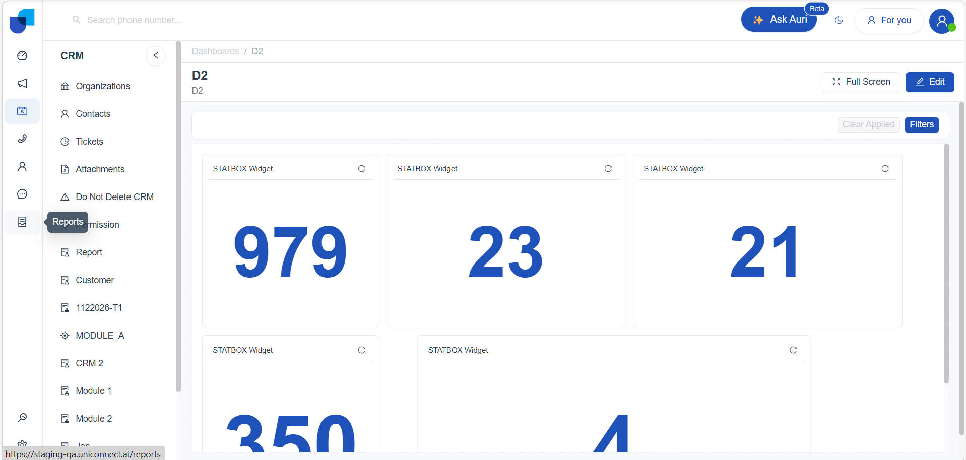
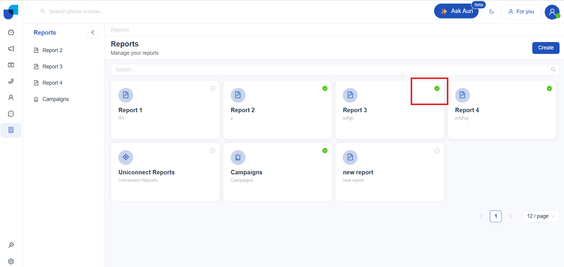
This opens the main Reports page, where all your existing reports are displayed in tile format.
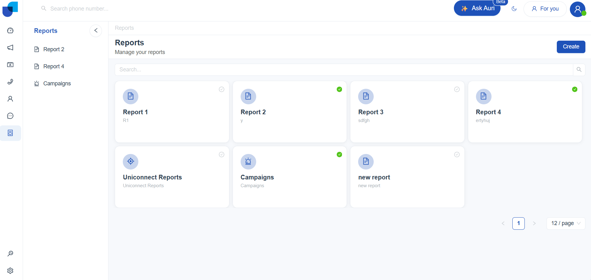
Once you're on the Reports page, follow these steps to create a new report:
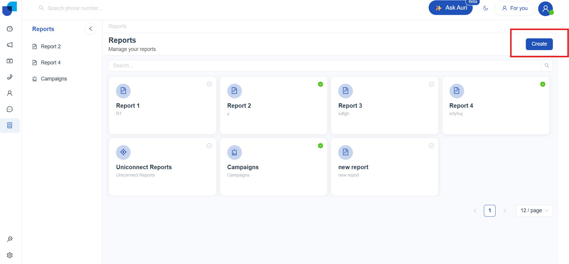
- Click Create (top‑right corner).
- A Create Item dialog appears. Fill in:
- Title – Name of your report (required)
- Description – Brief summary (required)
- Icon – Choose an icon for easy recognition
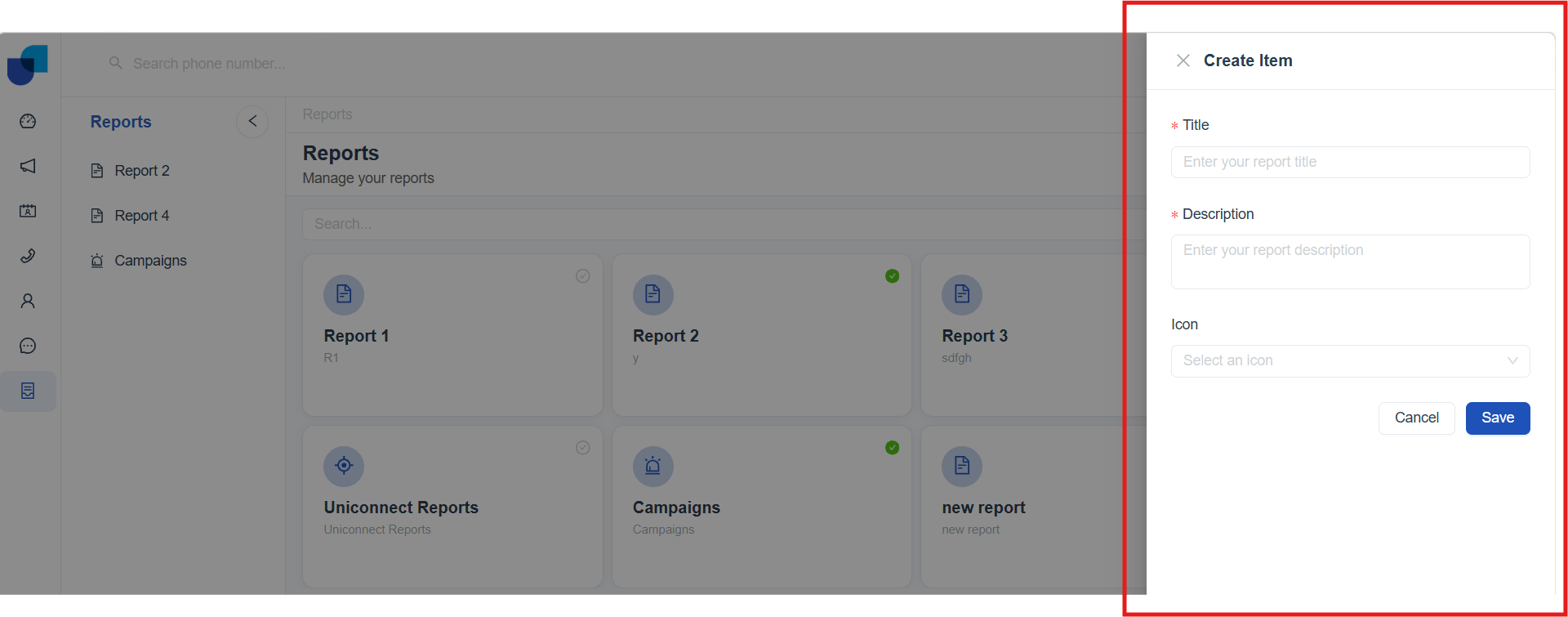
- After filling in the required fields, click Save to create your report.
Your new report will now appear on the Reports page. Click it to open the report work space and begin building visuals.
Report Configurations
Once your report is created, UniConnect takes you to the Builder interface. Here, you’ll find three tabs Build, Preview, and Edit Details that walk you step by step through assembling visuals, checking how your report looks, and adjusting its settings.
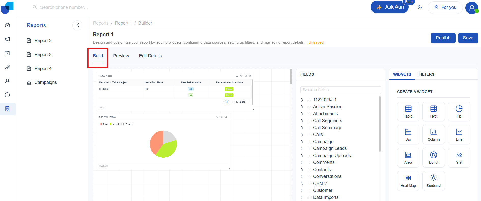
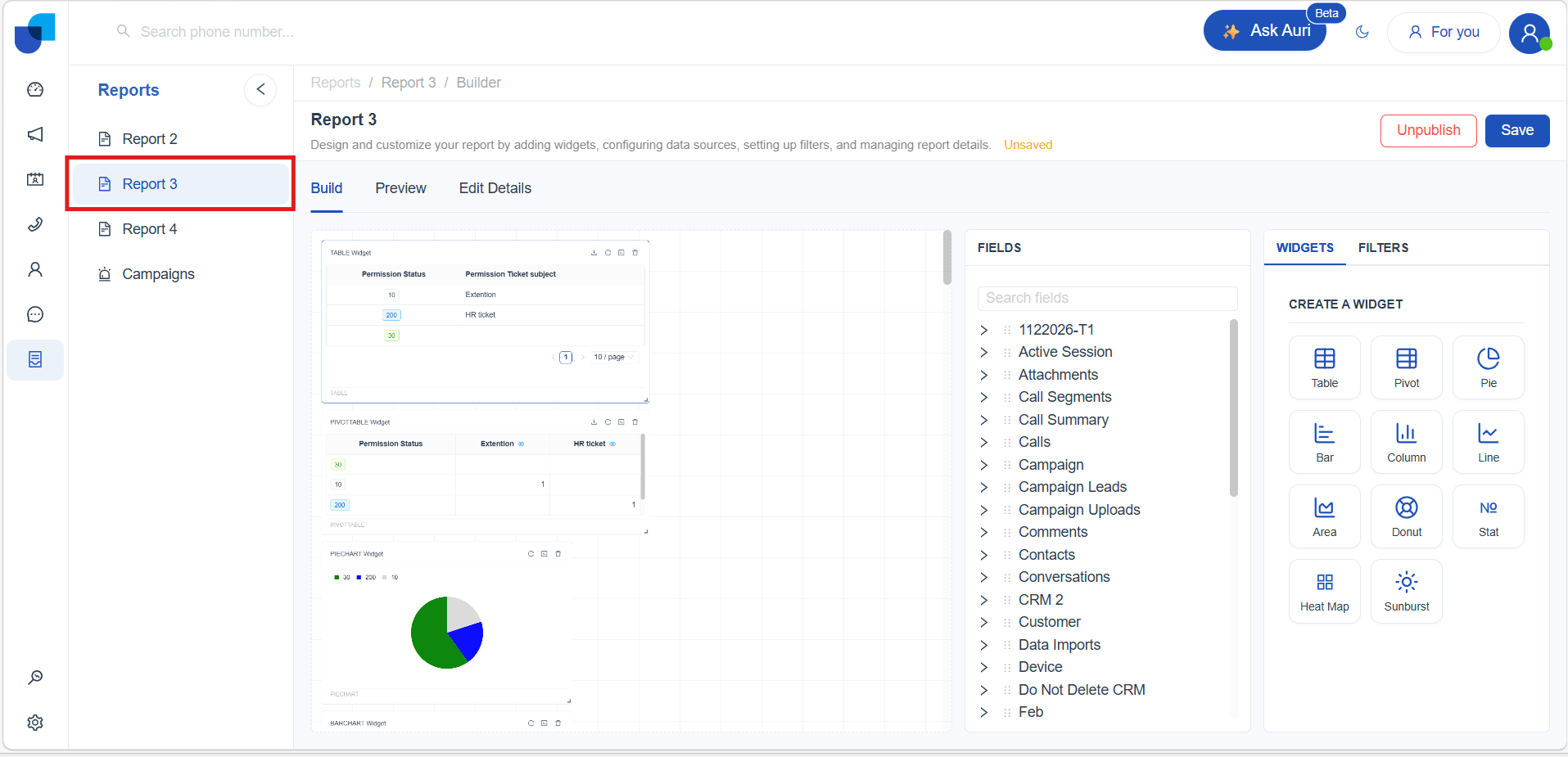
Build Tab
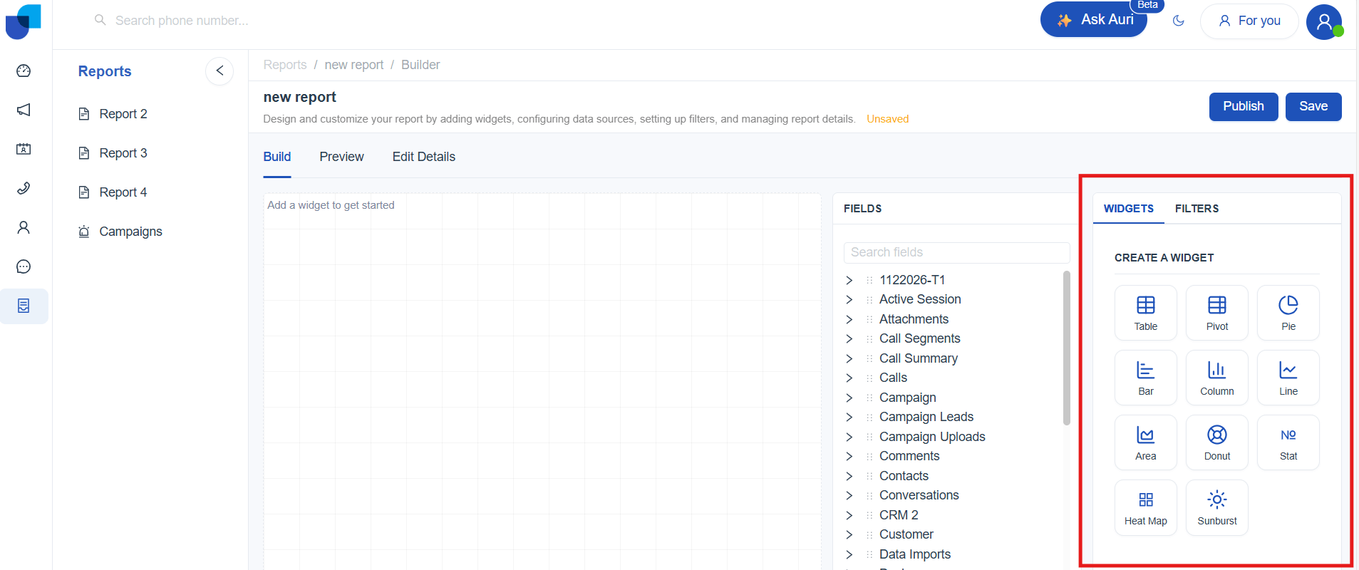
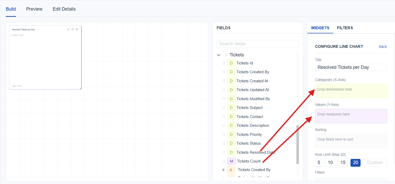
The Build tab is where you design the main layout of your report in Uniconnect. This work space gives you a clear canvas to assemble your visuals and shape the overall structure of your report. On the left, you’ll see your list of available fields (link to meta panel). This panel represents the data points you can drag into your report. On the right, the Widgets panel (link to widget panel) lets you choose from a variety of visual elements such as tables, charts, and graphs. Simply click on a widget and drop it onto the canvas to start building your report.
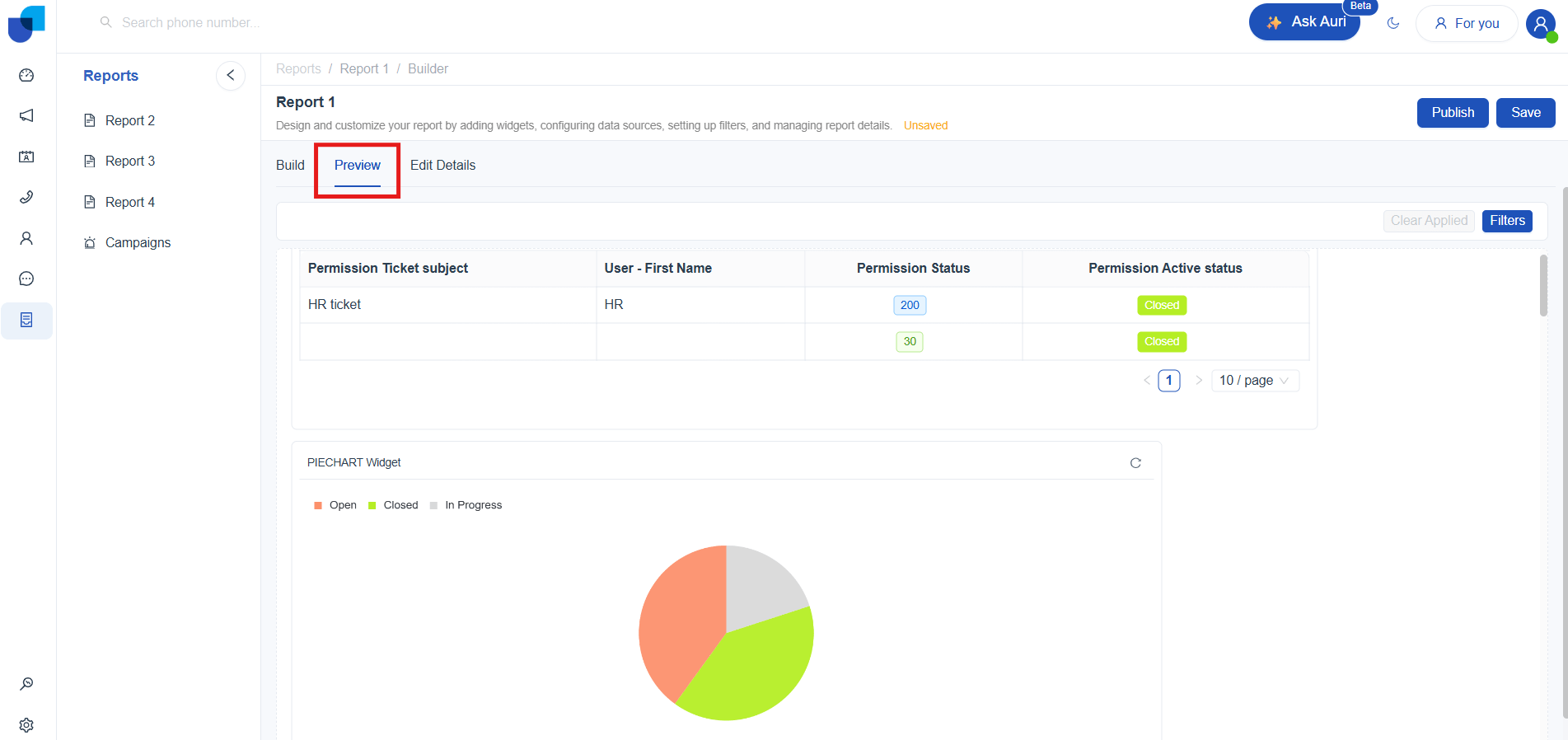
Preview Tab
The Preview tab shows you what the final report will look like to your users. It displays the report exactly as it will appear once published clean, interactive, and without the editing tools. This makes it easier to confirm that your visuals, filters, and data are working correctly before you publish them.
Edit Details Tab
The Edit Details tab is where you manage the basic settings and properties of your report. It gives you a straightforward space to update key information and control how the report appears to others. Access to this tab depends on user permissions (link to permissions).
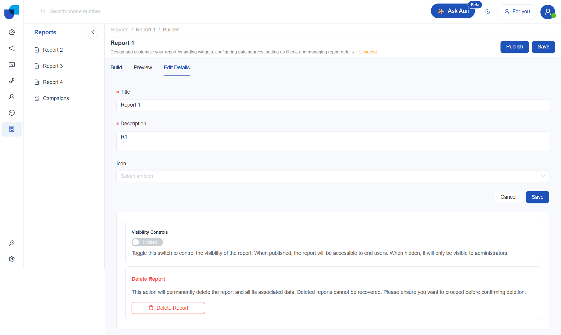
You can:
-
Edit the report title - Change the name shown in the reports list.
-
Update the description - Modify the report description
-
Choose an icon - Select an icon to help users easily recognize the report.
-
Control visibility - Toggle the switch to make the report Published or Hidden. Published reports are available to end users, while hidden reports are only visible to administrators.
-
Delete the report - Permanently remove the report and its data (cannot be undone).
[!WARNING] Once you delete a report, it cannot be undone. Make sure you no longer need the report or any of its data before confirming the
Meta Palette
The Meta Data Palette provides a complete list of all available modules that can be used to build reports. Each category can be expanded to view its fields, and fields can be dragged into configuration areas such as Rows, Columns, Values, or Filters to structure and visualize data. A search option is also available to quickly locate fields within the palette.
The palette includes data from the following sections:
- Calls (Link to calls in Table)
- Campaigns (Link to Campaigns in Table)
- CRM Modules (Link to Modules in Table)
- User Management (Link to User Management in Table)
- Workflow (Link to Workflows in Table)
[!IMPORTANT] Access to data within the Meta Data Palette depends on user permissions. Only fields permitted under role management will appear. (Link to Role Management)
Field Type Indicators
Each field in the Meta Data Palette is marked with a label to indicate the field type. These indicators help identify how the field behaves inside widgets.
1. D — Dimension
Represents a categorical field, such as names, statuses, types, dates, or labels.
2. M — Measure
Represents a numeric or calculable field, such as counts, totals, durations, or any value that can be aggregated.
3. A — Allied
Represents fields that come from a related module exposed through an existing relationship, allowing access to additional data linked to the current module
The system supports several relationship types that define how data moves between modules. Each relationship determines how fields appear in the report builder and how related attributes can be used in visualizations.
-
Linking CRM Modules Together (CRM ↔ CRM)
one to many
-
A reference field is created on the “many” side
-
Dragging the reference field shows only the ID
-
To show readable information (like Name, Code, Category), fields must be dragged from the related module section in the metadata palette.
many to one
-
A reference field is created on the “many” side
-
Dragging the reference field shows only the ID
-
To show readable information (like Name, Code, Category), fields must be dragged from the related module section in the metadata palette
-
-
Linking CRM records with Users (CRM ↔ User)
Every CRM module automatically connects to the User module through system fields such as Created By and Updated By. These fields always link CRM records to the users who created or updated them.
Additional CRM–User relationships can also be created:
one to one - on hold
many to one
When a Many‑to‑One relationship is created between a CRM module and the User module, an Allied User table appears under the related module section in the metadata palette.
This allows selecting user details (such as Name, Email) directly in a report.
many to many - on hold
Meta Fields Overview
| Category | Required Permission | Field | Explanation |
|---|---|---|---|
| CRM Modules | Specific CRM Module's View Permission | CRM Id | Unique identifier of the CRM Record |
| Created at | Date and time when the CRM record was created. | ||
| Updated at | Date and time when the CRM record was last updated | ||
| Created By | User who created the record | ||
| Modified By | User who last updated the record | ||
| Count | Total count of modules | ||
| User Management - Users | Users – View permission | User Id | Unique identifier of the user. |
| Users First Name | First name of the user | ||
| Users Last Name | Last name of the user | ||
| Users Email | Email address of the user | ||
| Phone Number | Contact number associated with the user. | ||
| Extension | 3CX extension assigned to the user | ||
| Tcx User id | Tcx user id | ||
| Image | URL of the user profile image | ||
| Is Active | Indicates whether the user account is active | ||
| Users Enabled 2FA | Shows whether two-factor authentication is enabled. | ||
| Role Id | Id of the role assigned to the user | ||
| Created at | Date and time the user was created. | ||
| Updated at | Date and time the user record was last updated. | ||
| Created by | User who created the record | ||
| Device | Device associated with the user | ||
| Type | User type | ||
| Status | Status of the user. | ||
| Count | Total count of users | ||
| User Management - Groups | Groups – view permission | Groups Id | Unique identifier of the group |
| Groups Label | Display name of the group. | ||
| Groups Code | System-generated code assigned to the group | ||
| Groups Extension | Extension numbers used for Queues and Ring Groups. | ||
| Groups Type | Defines whether the group is a queue, ring group, or other. | ||
| Groups Is Active | Indicates whether the group is active or inactive. | ||
| Groups SLA | SLA time | ||
| Groups Count | Total count of groups | ||
| User Management – User Groups | User view permission and group view permission | User Groups User Id | Unique identifier of the User |
| User Groups Group Id | Unique identifier of the group | ||
| User Groups Priority | Priority of the group | ||
| User Groups Status | Current status | ||
| User Groups Created at | Date and time of the group created | ||
| Updated at | Date and time of the group updated | ||
| User Groups Count | Total count of user groups | ||
| User Management - Roles | User view permission | Roles Label | Display name of the role |
| Roles Code | System-generated code assigned to the role | ||
| Role Is System Role | Indicates whether the role is a built-in system role | ||
| Roles Created by Id | ID of the user who created the role | ||
| User Management – Device | User view permission | Device d | Unique identifier assigned to each device. |
| Device Client | The browser or client application used | ||
| Device Type | Type of device being used | ||
| Device OS | Operating system of the device | ||
| Device Version | Version number of the operating system | ||
| Device Count | Total count of devices | ||
| User Management – Active sessions | Users View Permission | Active session Id | Unique identifier assigned to each active session. |
| Active session user Id | ID of the user who is holding the session. | ||
| Active session Connection Type | Method used to connect, such as WEB, EDGE | ||
| Active session Device Id | Device ID associated with the session | ||
| Active session count | Total count of active sessions | ||
| User Management – Work Shift | Users View Permission | Work Shifts User Id | ID of the user who belongs to the work shift. |
| Work Shifts Start Time | Start time of the work shift | ||
| Work Shifts End Time | End time of the work shift | ||
| Work Shifts Count | Total count of work shifts | ||
| Call – Call Segments | Access call logs permission | Call Segments Id | Unique identifier for the call segment record. Each segment represents a single leg or stage within a call. |
| Call Segments Call Id | Identifier of the parent call. Multiple call segments can belong to the same call. | ||
| Call Segments Tcx Connection Id | Unique identifier of the connection session generated by the 3CX system for this call segment. Used to track the specific call leg internally. | ||
| Call Segments Start Time | The timestamp when the call segment started. | ||
| Call Segments End time | The timestamp when the call segment ended. | ||
| Call Segments Status | Status of the segment (for example: connected, ringing, completed, failed, abandoned). | ||
| Call Segments Source number | Phone number or extension from which the call segment originated. | ||
| Call Segments Source Type | Type of the source endpoint. Examples include Extension, Queue, IVR, ExternalLine, RingGroup, etc. | ||
| Call Segments Destination Number | Phone number or extension that received the call segment. | ||
| Call Segments Destination Type | Type of the destination endpoint (Extension, Queue, IVR, ExternalLine, RingGroup, etc.). | ||
| Call Segments Creation Method | Method used to create the call segment, such as direct call, transfer, queue routing, IVR routing, or system-generated routing. | ||
| Call Segments Termination Reason | General reason why the call segment ended (e.g., completed, caller hung up, agent hung up, timeout). | ||
| Call Segments Termination Reason Detail | More detailed explanation of the termination reason, often including system-level details about how the segment ended. | ||
| Call Segments Is Inbound | Boolean value indicating whether the segment is inbound (true) or outbound (false). | ||
| Call Segments User Id | Identifier of the user (agent/extension owner) associated with the call segment, if applicable. | ||
| Call Segments Group Id | Identifier of the group (such as queue or department) associated with the call segment. | ||
| Call Segments Is Active | Indicates whether the call segment is currently active (true) or already completed (false). | ||
| Call Segments Count | Number of call segments associated with the call or used for aggregation in reporting queries. | ||
| Call Segments Duration | Total duration of the call segment, usually calculated as End Time − Start Time, typically measured in seconds. | ||
| Call - Calls | Access Call log permission | Calls Id | Unique identifier for the call record. Represents a single call instance in your system. |
| Call History Id | Identifier from 3CX Call History. Used to map this call with 3CX’s internal call tracking and CDR (Call Detail Records). Helps link multiple segments/events of the same call. | ||
| Call Type | Type of the call based on system enum: • Internal – Between extensions inside the system • Inbound – Incoming call from external source • Outbound – Outgoing call to external number • conference – Multi-party conference call • Campaign – Calls initiated via dialer/campaign module | ||
| Call Status | Current or final state of the call based on system-defined statuses • Dialing - Call is being initiated (outgoing attempt in progress). • Ringing - Destination is ringing but not yet answered. • On Call - Call is actively connected and ongoing. • Terminated - Call has ended (normal or forced termination). • Hold - Call is placed on hold temporarily. • Muted - Call is active but audio is muted on one side. Queue Waiting - Caller is waiting in a queue before being answered. • Wrap up - Post-call processing stage (agent finishing notes/actions). • Lead Up - Pre-call preparation stage (typically before connecting to a lead in campaigns). • Answered - Call was successfully answered. • Not Answered - Call was not answered (no pickup). • Abandoned - Caller disconnected before being answered (usually in queue). | ||
| Lead id | Identifier from CRM Leads module or Leads Upload module. Links the call to a specific customer/prospect. | ||
| Start Time | Timestamp when the call started (first event captured in the system). | ||
| Transcript | Diarized transcription of the call, showing who spoke and what was said. | ||
| Summary | Concise summary of the call content. | ||
| Conference Id | Identifier from 3CX used to group multiple participants in a conference call. | ||
| Calls Count | Aggregated count of calls. Typically used in reporting (e.g., total calls per agent, per campaign, per day). | ||
| Call - Ivr | Access Call log permission | Ivr Label | Display name of the IVR or Call Script (e.g., “Main Menu”, “Support Flow”, “Campaign Script”). Used for identification in UI and reports. |
| Ivr Extention | The extension number assigned to the IVR in 3CX (e.g., 8000, 8010). This is the entry point for calls. | ||
| Ivr Type | Type of the flow: • ivr – Standard IVR (Digital Receptionist / menu-based routing) • call script – Script-driven flow used in campaigns or guided call handling | ||
| Ivr Created at | Timestamp when the IVR or call script was created. | ||
| Ivr updated at | Timestamp of the most recent update to the IVR or call script. | ||
| Ivr Count | Total number of calls or interactions handled by this IVR or call script. Used for analytics and reporting. | ||
| Call – Summarize Calls | Access Call log permission | Call Id | Unique identifier of the call. One call can have multiple segments but is aggregated into a single record here. |
| Agent Id | Identifier of the agent (user/extension) who handled the call. Derived from call segments. | ||
| Group Id | Identifier of the queue/group associated with the call. Used for queue-based analytics. | ||
| Ivr Id | dentifier of the IVR or call script involved in the call flow. | ||
| Customer Number | External customer phone number extracted from call segments based on inbound/outbound logic. | ||
| Hotline | Internal hotline/extension number used in the call (entry point or agent side). | ||
| Direction | Direction of the call: • inbound • outbound (includes adjusted logic for internal calls). | ||
| Start Time | Earliest start time of the call across all segments (beginning of the call). | ||
| Lead Up Time Duration | Time spent before call connection (e.g., campaign preparation or pre-call setup). | ||
| Hold Time Duration | Total time the call was on hold. | ||
| Wrap Time Duration | Time spent in post-call processing (agent wrap-up). | ||
| Mute Time Duration | Total time the call was muted. | ||
| Talk Time Duration | Actual conversation time when the call was active (oncall). | ||
| Ring Time Duration | Time spent ringing before being answered. | ||
| Dial Time Duration | Time spent dialing before ringing/connection. | ||
| Queue Wait Duration | Time caller spent waiting in a queue before being answered or abandoned. | ||
| Is Answered | TRUE if the call was answered at least once (based on call status). | ||
| Is Repeated | TRUE if the same customer made another inbound answered call within the last 24 hours. | ||
| Is SLA Breached | TRUE if queue wait time exceeded the configured SLA for the group. | ||
| Is Abandoned | TRUE if the call was not answered and belongs to a queue (caller dropped before agent answered). | ||
| Creation Method | Method used to initiate the call (e.g., manual, IVR, campaign dialer). | ||
| Termination Reason | Reason why the call ended (e.g., completed, hang-up, timeout). | ||
| Transcript | Diarized transcription of the call, showing who spoke and what was said. | ||
| Summary | Concise summary of the call content. | ||
| Sentiment | Sentiment analysis result of the call (e.g., positive, neutral, negative). | ||
| Recording URL | Link to the call recording stored in the system. | ||
| Total call count | Total number of unique calls. | ||
| Abandoned call count | Number of calls abandoned in queue (not answered & group exists). | ||
| Queue answered call count | Calls answered within queue (answered + not abandoned + group exists). | ||
| Repeated call count | Number of repeated inbound calls within 24 hours. | ||
| Answered call count | Total number of answered calls. | ||
| Unanswered call count | Total number of unanswered calls. | ||
| Answer Rate | Percentage of answered calls: (answered / total calls) × 100. | ||
| Unanswered rate | Percentage of unanswered calls: (unanswered / total calls) × 100. | ||
| Abandoned within 5sec count | Calls abandoned within 5 seconds of queue waiting. | ||
| Abandoned within 10sec count | Calls abandoned within 10 seconds. | ||
| Abandoned within 15sec count | Calls abandoned within 15 seconds. | ||
| Answered within SLA count | Calls answered within defined SLA (queue wait ≤ SLA threshold). | ||
| Service level | Percentage of calls answered within SLA compared to total answered queue calls. | ||
| Talk Duration | Total talk time across calls. | ||
| Avg Talk Duration | Average talk time per call. | ||
| Ringing Duration | Total ringing time. | ||
| Avg Ringing Duration | Average ringing time per call. | ||
| Queue waiting Duration | Total time callers spent in queue. | ||
| Avg Queue waiting Time | Average queue waiting time. | ||
| Hold Time | Total hold duration. | ||
| Avg hold Time | Average hold duration per call. | ||
| Wrap time | Total wrap-up duration. | ||
| Avg wrap Time | Average wrap-up time. | ||
| Mute Time | Total mute duration. | ||
| Avg Mute Time | Average mute duration. | ||
| Campaign | View Campaign Permission | Campaign Id | The unique identifier of the campaign |
| Title | The title of the campaign. | ||
| Schedule Start | The start date and time when the campaign begins. | ||
| Schedule End | The end date and time when the campaign stops | ||
| Channel | The communication channel used | ||
| Audience Type | CSV or Module | ||
| Campaign Type | The type of campaign execution | ||
| Campaign Run Field | The field used to control or trigger campaign execution. | ||
| Sorting Field | The field used to order or prioritize records during execution. | ||
| CSV file | uploaded CSV file containing campaign leads | ||
| Filter | Defines conditions used to filter the target audience | ||
| Module | The module associated with the campaign data | ||
| Audience Module Id | The identifier of the module used to fetch the audience | ||
| Recurring | Indicates whether the campaign runs repeatedly | ||
| Recurrence | Defines the pattern or frequency of recurring campaigns | ||
| Retry Attempts | The maximum number of retry attempts if the campaign action fails | ||
| Retry Interval | The time interval between retry attempts | ||
| Save as Template | Indicates whether the campaign is saved as a reusable template | ||
| Handler Type | Handler type used for campaign execution | ||
| Sync Runtime | Specifies whether the campaign runs synchronously or asynchronously | ||
| Status | The current state of the campaign | ||
| Disposition Module Id | The module used to store disposition data | ||
| Disposition Pre Fill values | The default values pre-filled for disposition fields. | ||
| Created at | The timestamp when the campaign was created. | ||
| Created by Id | The identifier of the user who created the campaign. | ||
| Updated by Id | The identifier of the user who last updated the campaign. | ||
| Is deleted | Indicates whether the campaign is soft deleted | ||
| Voice setting Id | The identifier for voice settings | ||
| WhatsApp setting Id | The identifier for WhatsApp messaging settings | ||
| Email Setting Id | The identifier for email configuration settings | ||
| SMS Setting Id | The identifier for SMS configuration settings | ||
| Count | The total number of campaigns | ||
| Campaign – Campaign Uploads | View Campaign Permission | Created by Id | Identifier of the user who created the upload record |
| Modified by Id | Identifier of the user who updated the upload record | ||
| Created at | Date and time when the upload was created | ||
| Updated at | Date and time when the upload was updated | ||
| Mobile Number | Phone number associated with the uploaded lead | ||
| Campaign | Campaign to which the uploaded data belongs | ||
| Count | Campaign upload count | ||
| Campaign – Campaign Leads | View Leads Permission | Leads Id | Unique identifier for campaign lead |
| Picked for dialing at | Timestamp when the lead was selected for dialing. | ||
| Attempt | Current attempt number | ||
| Is Deleted | Indicates whether the lead is marked as deleted | ||
| Campaign Id | unique identifier of the campaign associated with the lead | ||
| Lead Id | unique identifier of the lead | ||
| Module Id | Unique Identifier of the module | ||
| Created at | Date and time when the lead record was created | ||
| Updated at | Date and time when the lead record was updated | ||
| Lead status | Current status of the lead | ||
| Channel | Communication channel | ||
| Follow up | Followup message if available | ||
| Count | Campaign leads count | ||
| Created by Id | Identifier of the user who created the lead. | ||
| Modified by Id | Identifier of the user who last modified the lead. | ||
| Campaign – SMS Campaign Setting | Manage Campaign Permission | Sender Id | |
| Template Id | Unique identifier for template | ||
| Raw Template | Raw template | ||
| Count | Count of templates | ||
| Auri - Conversations | Manage Conversations Permission | Conversation Name | Display the name of the conversation |
| Conversation Type | Type of conversation such as Report, Agent, Email, WhatsApp, or SMS | ||
| Conversation Created by id | Unique identifier of the user who created the conversation | ||
| Conversation Agent Id | Unique identifier of the agent associated with the conversation (used in agent-based chats) | ||
| Conversation Module Id | Unique identifier for the module | ||
| Conversation Record Id | Unique identifier for the module | ||
| Conversation Call Id | |||
| Conversation Summary | AI-generated summary of the conversation | ||
| Conversation Metadata | Additional structured data stored as JSON | ||
| Conversation Created at | Timestamp when the conversation was created | ||
| Conversation Last Summarized Message Id | ID of the last message used to generate the summary | ||
| Conversation Updated at | Timestamp when the conversation was last updated | ||
| Conversation Last Summarized at | Timestamp when the conversation was last summarized | ||
| Conversations Count | Total number of conversations (used for aggregation) | ||
| Total Token Count | Total number of tokens used across all messages in the conversation | ||
| Average Token Count | Average number of tokens used per conversation (used for aggregation) | ||
| Total Summary Token Count | Total number of tokens in the most recent summary of the conversation | ||
| Messages | Manage Conversations Permission | Conversation Id | Unique identifier of the conversation to which the message belongs |
| User Type | Indicates who sent the message, such as User, Bot, Customer, System, or External | ||
| Message From Id | Unique identifier of the message sender | ||
| Participant Id | Unique identifier used for voice calls | ||
| Status | |||
| Failure Reason | Reason for failure, if message failed | ||
| Message Id | Unique Id for message | ||
| Message | Status of the message | ||
| Message Text | Text included in the message | ||
| Message Type | Can be Email/ text/ WhatsApp | ||
| Created at | Timestamp when the message was created in the conversation | ||
| Delivered Time | Message Delivered Time | ||
| Sent Time | Message sent time | ||
| Read Time | Message Read Time | ||
| Count | Total number of messages (used for aggregation) | ||
| Total Token Count | Number of tokens used in the message | ||
| Average Token Count | Average tokens per message (used for aggregation) | ||
| Workflow – Workflow Executions | Manage Workflow Permission | Workflow Id | Unique identifier for the workflow |
| Record Id | Unique identifier for the record | ||
| Schedule Id | Unique identifier for the schedule | ||
| Status | Workflow status | ||
| Current Node | Current node | ||
| Metadata | Flexible JSON field that stores extra execution-related information | ||
| Data | Data of the workflow | ||
| Result | Final output/result produced after the workflow finishes successfully | ||
| Error | Error details or messages if the workflow execution fails. | ||
| Started at | Workflow started time | ||
| Completed at | Workflow completed time | ||
| Count | Count of workflows | ||
| Total Executions | Total count of executions | ||
| Completed Executions | Total count of completed executions | ||
| Failed Executions | Total count of failed executions | ||
| Average Duration (seconds) | Average duration of the execution | ||
| Workflow – Workflow Logs | Manage Workflow Permission | Execution Id | Unique identifier for execution |
| Node Id | Unique identifier for the node | ||
| Node Type | Type of the node | ||
| Status | Execution status of the node | ||
| Message | Error messages or additional info related to the node execution. | ||
| Data | Extra node-specific execution details | ||
| Timestamp | Date and time when the log entry was created. | ||
| Count | Count of execution logs |
Custom Measures and Dimensions
Reporting often requires more flexibility than what standard fields and metrics provide. To support business‑specific logic, custom groupings, and derived values, the Uniconnect Reports offers Custom Dimensions and Custom Measures. These features allow users to define meaningful categorizations and reusable calculations based on existing data, enabling accurate and consistent reporting without modifying source data or requiring technical intervention.
Custom Dimensions
Custom Dimensions help transform raw data into meaningful classifications, such as custom statuses, ranges, or labels, without changing the underlying data source. Once created, these dimensions behave like standard fields and can be used across reports for filtering and grouping.
How to create a custom dimension
-
In the Meta panel, locate the module where the custom dimension needs to be created.
-
Click the plus (+) icon next to the selected module.

-
The Add Custom Field template opens.
-
By default, the Field Type is set to Dimension.
-
Enter a Name for the custom dimension.
-
select the appropriate Data Type based on the nature of the values returned by the expression.
String: Used for textual or label‑based values. Number: Used for numeric values that may be used for sorting or grouping. Boolean: Used for true/false conditions. Time: Used for date or time‑based values. Switch: Used for conditional or binary logic with custom labels. Geo: Used for geographical data that can be mapped
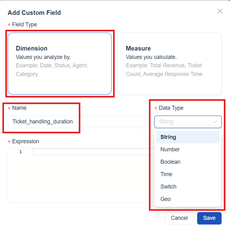
- In the Expression field, define how the custom dimension should be created by writing a SQL expression.

-
Click Save to create the custom dimension.
-
After saving, the custom dimension appears under the selected module in the Meta panel, with options to Edit or Delete the dimension.

Custom Measures
Custom Measures allow users to define reusable calculations that return numeric or derived values based on business logic. They are used to calculate metrics such as totals, averages, counts, and other performance indicators. Once created, custom measures behave like standard measures and can be used across reports for analysis and aggregation.
How to create a custom Measure
-
In the Meta panel, locate the module where the custom measure needs to be created.
-
Click the plus (+) icon next to the selected module.
-
The Add Custom Field template opens.
-
Select Measure as the Field Type
-
Enter a Name for the custom measure.
-
select the appropriate Data Type based on the nature of the values returned by the expression.
Count: Used to count records. Sum: Used to calculate the total of numeric values. Average: Used to calculate the average value. Minimum: Used to return the smallest value. Maximum: Used to return the largest value. Number: Used for numeric calculated results. String: Used when the measure returns text values. Time: Used for time‑based calculated results. Boolean: Used for true/false calculated outcomes. Number Aggregate: Used for aggregated numeric calculations. Unique count: Used to count distinct values. Estimate: Used to return estimated values based on logic.
-
In the Expression field, define how the custom measure should be created by writing a SQL expression.
-
Click Save to create the custom measure.
-
After saving, the custom measure appears under the selected module in the Meta panel, with options to Edit or Delete the measure.
Widgets Panel
The Widgets panel provides all available visualization options for building reports. From here, different widget types such as charts, tables, pivots, and metrics can be added to the report canvas. Each widget supports a specific analysis need, allowing data to be viewed, compared, and explored in multiple ways.

Design Report with Widgets
Use widgets to bring your report to life, add charts, tables and filters to turn raw data into clear, interactive insights.
How to Add a Widget to the Report Builder
Adding a widget to your report is simple. Follow these steps:
- In the Build tab, you can view the Widgets panel on the right side of the screen.
-
Click on a widget (link to Choose The Best Widget For the Report).
-
The widget appears instantly on the canvas.
-
The configuration panel will open automatically, allowing you to customize the widget.(link to widget configuration)
-
Widget action icons : Each widget added to the canvas includes a set of quick‑action icons that help manage and inspect the widget.
-
Refresh Widget - Updates the widget with the latest data based on the current filters and configurations.
-
View Query - Displays the underlying query generated for the widget
-
Delete Widget - Removes the widget from the report canvas.
-

Choose The Best Widget For the Report
Picking the right widget makes your data easier to read, understand, and act on. Before choosing a visual, think about the message you want to highlight. Different visuals are better suited for different types of insights.
| Category | When to Use | Chart Type |
|---|---|---|
| Categorical comparisons*(link to categorical comparisons)* | Show how values differ across categories or segments. | Bar, Column |
| Time based comparisons*(link to time based comparison)* | Show changes, patterns over time. | Line, Area |
| Part to Whole relationships*(link to part to whole relationships)* | Show how components contribute to a total. | Pie Donut Sunburst |
| Detailed Data and Exact Values*(link to detailed data and exact values)* | Show exact numbers, Detailed records | Table, Pivot, Stat Box |
| Pattern and Density Insights*(link to pattern and density insights)* | Show intensity, frequency, or patterns across two dimensions using color. | Heatmap |
[!NOTE] Your audience matters. Select widgets that fit their level of detail and how they consume information.
Categorical Comparisons
What is Column Chart
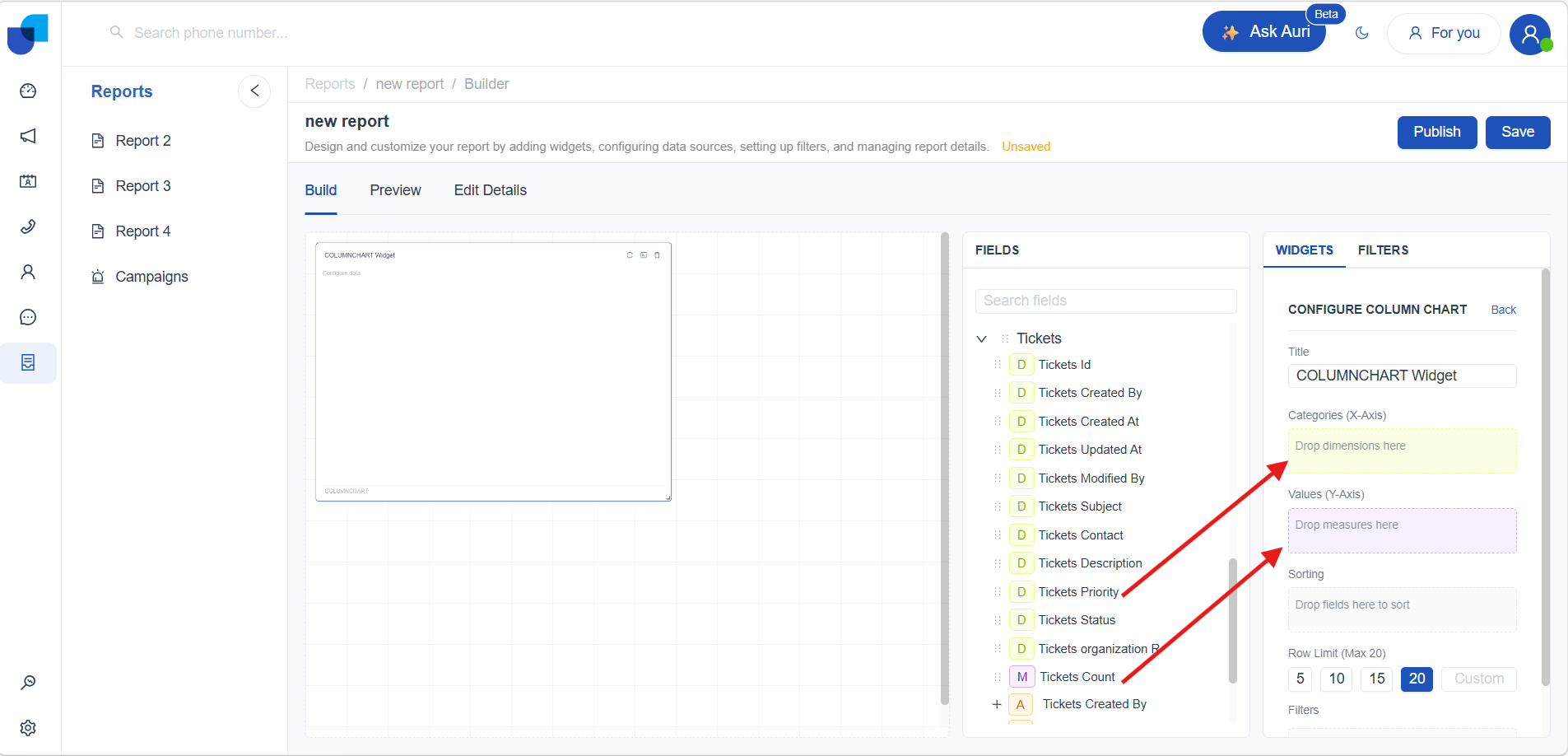
A column chart uses vertical bars to compare values across categories. This chart type is helpful for highlighting differences between groups and understanding which categories perform higher or lower relative to each other . How to create a Column Chart
- Select the Column Chart widget from the Widgets panel to add a blank chart to the report builder. Once selected, the Widget Configuration Panel for the Column Chart will open automatically, allowing configuration of the chart.

- Add a title using the Title field in the configuration panel.
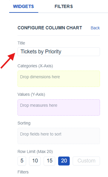
-
Resize the chart widget on the builder to fit the required layout (link to widget layout)
-
From the Meta Panel*(link to Meta panel)*, identify the appropriate dimension and value fields needed for the chart.
-
Drag the identified fields into the Widget Configuration Panel (link to widget configuration) by placing:
- Categories (X‑Axis) : Drag a dimension to represent the categories displayed as vertical columns
- Values (Y‑Axis) : Drag a measure to determine the count shown as the column height.
- Save the report using the Save button and switch to Preview Mode for a clearer and more interactive view of the created chart.
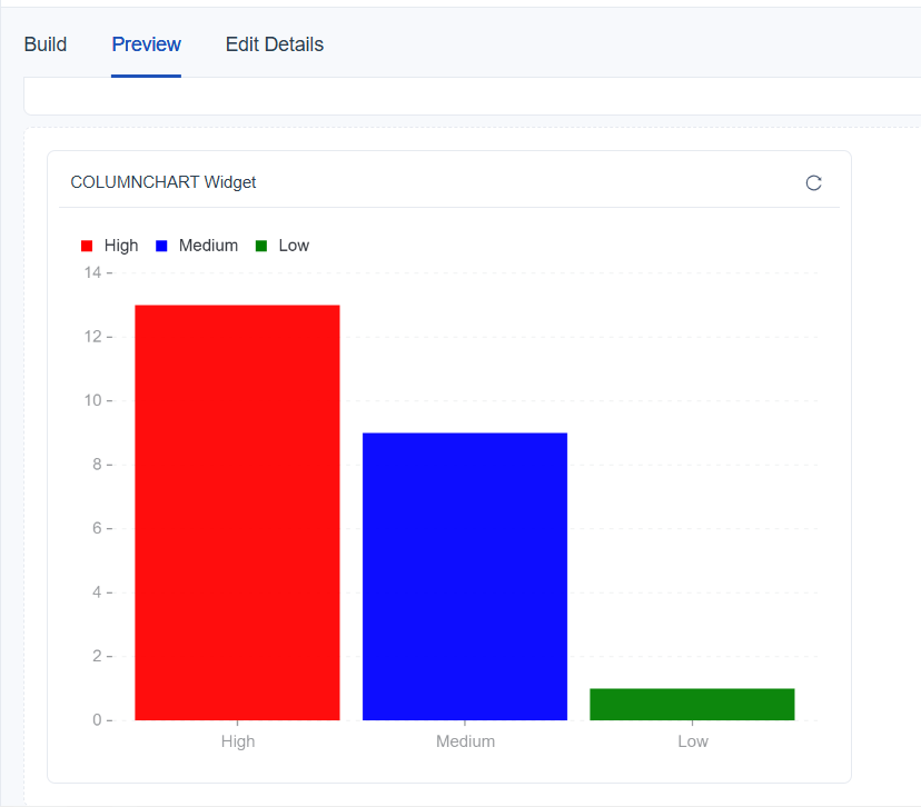
Better Understand With a User Scenario
The goal is to understand how many tickets fall under High, Medium, and Low priority, making it easier to identify which priority category receives the highest workload. By selecting Ticket Priority as the dimension and Ticket Count as the value, the chart groups the data and visually compares the volume across each priority level.
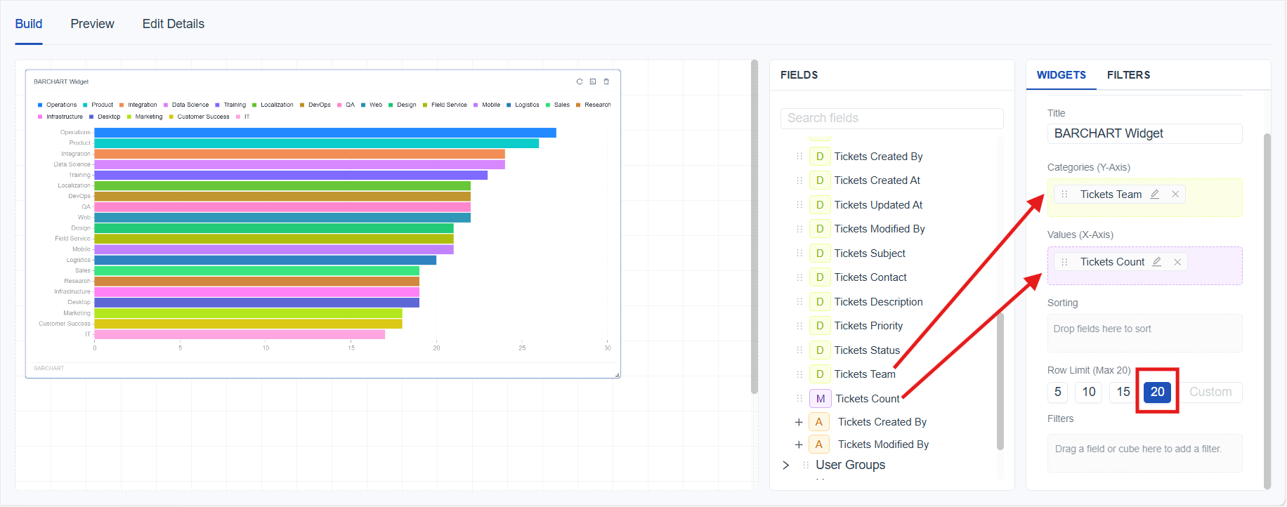
What is Bar Chart
A bar chart uses horizontal bars to compare values across categories. This chart type is ideal when category names are long or when many categories must be displayed clearly. Bar charts help visualize category‑based differences in a way that is easy to scan from left to right.
How to create a Bar Chart
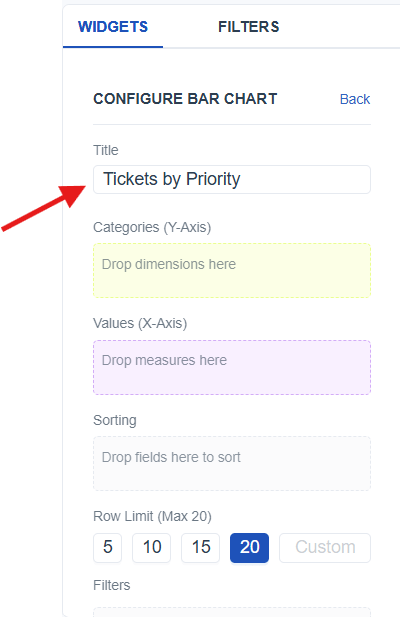
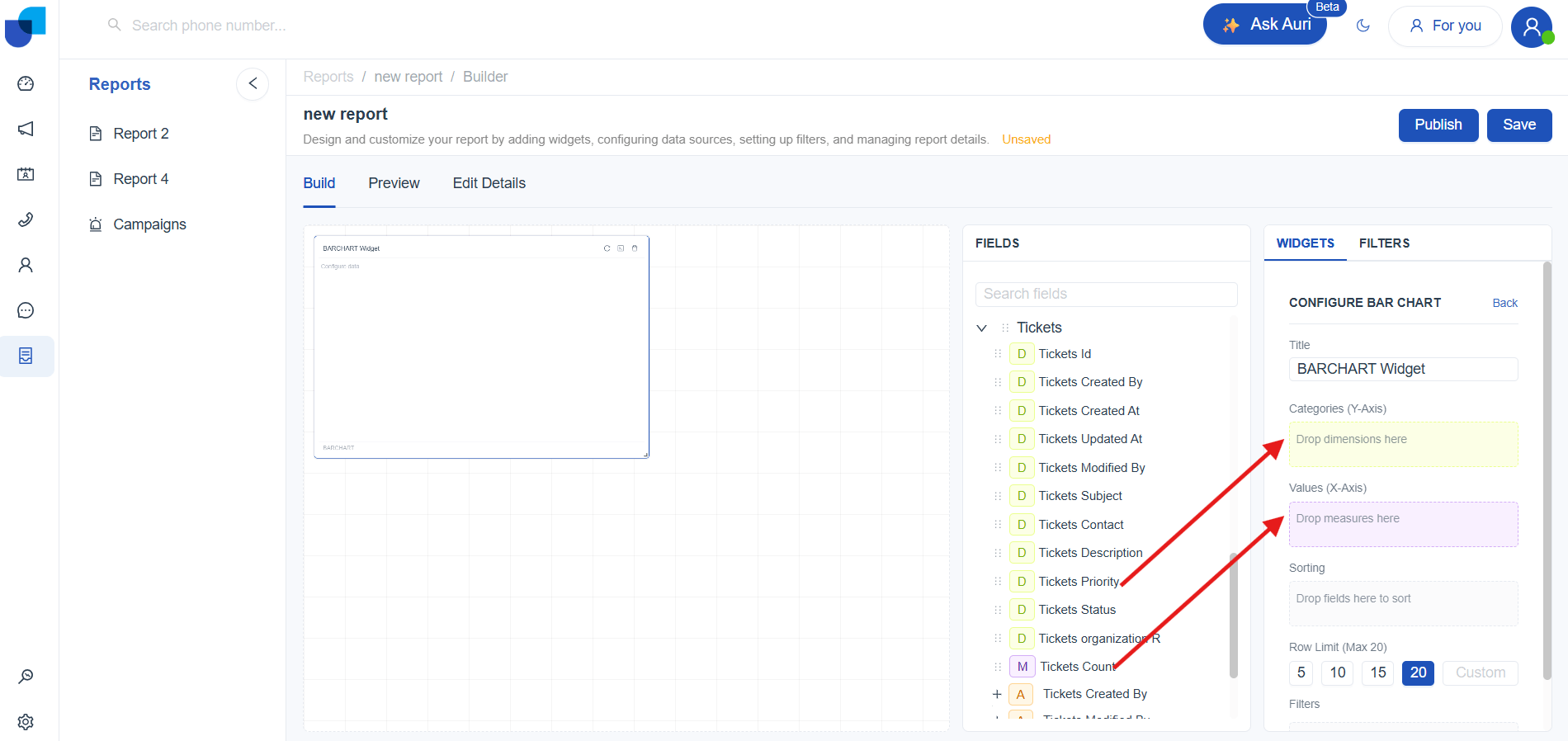
- Select the Bar Chart widget from the Widgets panel to add a blank chart to the report builder. Once selected, the (link to Widget Configuration) Panel for the Bar Chart will open automatically, allowing configuration of the chart.

- Add a title using the Title field in the configuration panel.
-
Resize the chart widget on the builder to fit the required layout (link to widget layout)
-
From the Meta Panel*(link to Meta panel)*, identify the appropriate dimension and value fields needed for the chart.
-
Drag the identified fields into the Widget Configuration Panel (link to widget configuration) by placing:
- Categories (Y‑Axis) : Drag a dimension to represent the categories displayed as horizontal bars.
- Values (X‑Axis) : Drag a measure to determine the count shown as the bar length.
- Save the report using the Save button and switch to Preview Mode for a clearer and more interactive view of the created chart.
Better Understand With a User Scenario
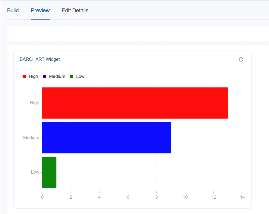
The goal is to understand how many tickets fall under High, Medium, and Low priority, making it easier to identify which priority category receives the highest workload. By selecting Ticket Priority as the dimension and Ticket Count as the value, the bar chart displays horizontal bars representing the number of tickets in each priority category, making it simple to compare them side by side.
Time Based Comparisons
What is Line Chart
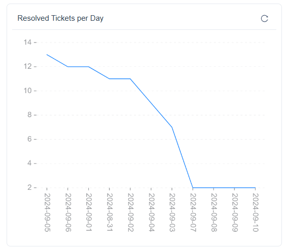
A line chart displays values over time using points connected by lines. It is ideal for showing trends, identifying increases or decreases, and comparing changes across different time periods. This chart type is commonly used to understand patterns such as daily ticket creation, weekly performance, or monthly resolution rates.
How to create a Line Chart
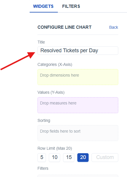
- Select the Line chart widget from the Widgets panel to add a blank chart to the report builder. Once selected, the (link to Widget Configuration) Panel for the Line Chart will open automatically, allowing configuration of the chart.

- Add a title to the chart using the Title field in the configuration panel to clearly name the visualization.
-
Resize the chart widget on the builder to fit the required layout (link to widget layout)
-
From the Meta Panel*(link to Meta panel)*, identify the appropriate dimension and value fields needed for the chart.
-
Drag the identified fields into the Widget Configuration Panel (link to widget configuration) by placing:
- Categories (X‑Axis) : Drag a time‑based dimension to represent the timeline on the chart.
- Values (X‑Axis) : Drag a measure to determine the count displayed as plotted data points along the line.
- Save the report using the Save button and switch to Preview Mode for a clearer and more interactive view of the created chart.
Better Understand With a User Scenario
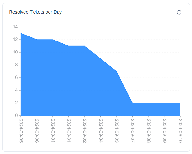
The goal is to see how many tickets are closed each day, making it easier to identify which days handled the highest resolution workload. By selecting Resolved Date as the time‑based dimension and Ticket Count as the value, the line chart displays the number of closed tickets for each day, helping compare daily resolution activity side by side.
What is Area Chart
An area chart displays values over time using a filled‑in area beneath the line. This chart type is useful for showing how totals change over a selected time period and for giving a clearer sense of volume compared to a simple line chart.
How to create a Area Chart
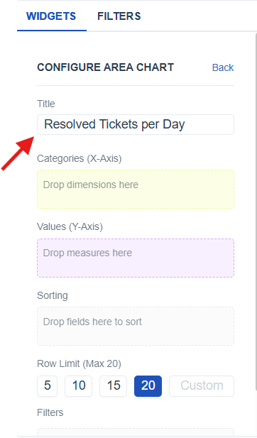
- Select the Area chart widget from the Widgets panel to add a blank chart to the report builder. Once selected, the (link to Widget Configuration) Panel for the area Chart will open automatically, allowing configuration of the chart.

- Add a title to the chart using the Title field in the configuration panel to clearly name the visualization.
-
Resize the chart widget on the builder to fit the required layout (link to widget layout)
-
From the Meta Panel*(link to Meta panel)*, identify the appropriate dimension and value fields needed for the chart.
-
Drag the identified fields into the Widget Configuration Panel (link to widget configuration) by placing:
- Categories (X‑Axis) : Drag a time‑based dimension to represent the area on the chart.
- Values (X‑Axis) : Drag a measure to determine the count shown in the filled area.
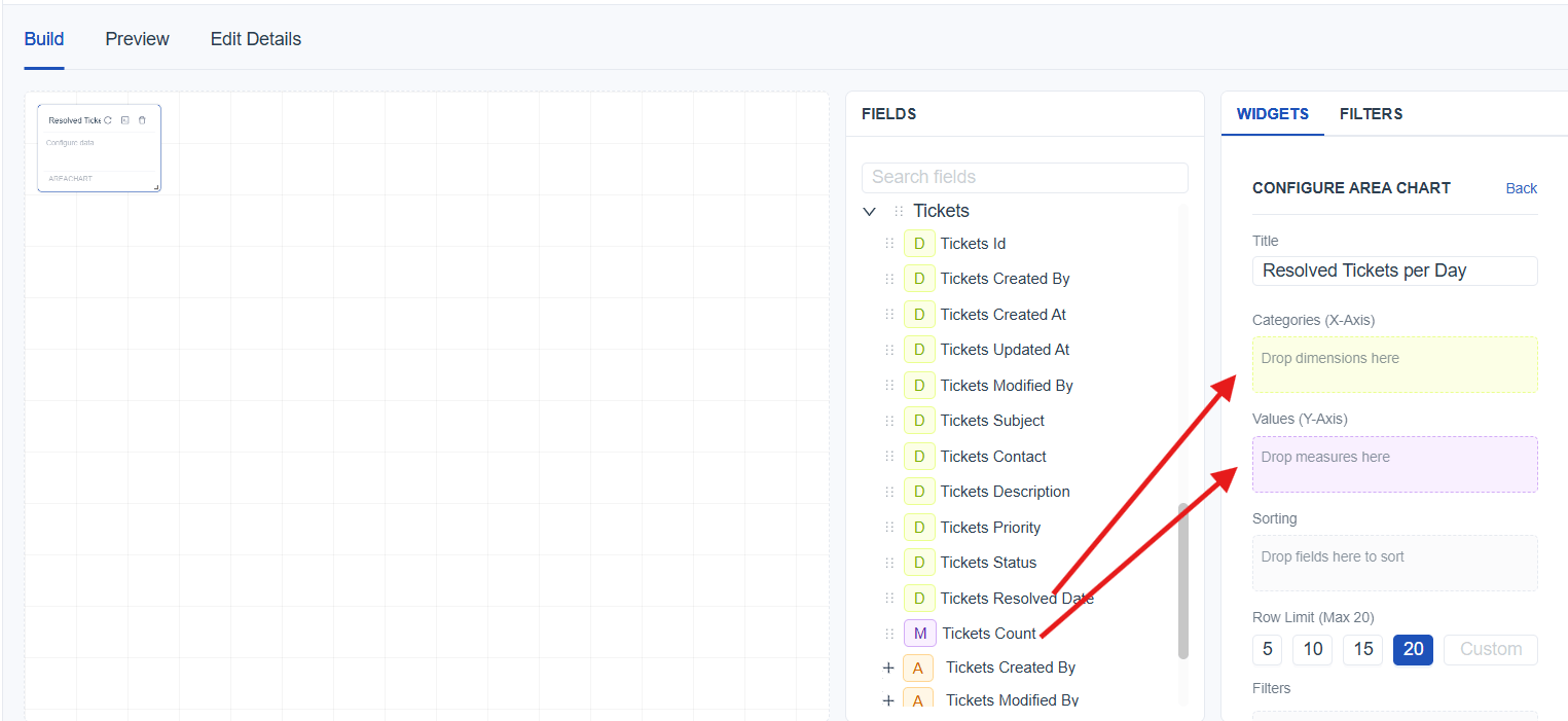
- Save the report using the Save button and switch to Preview Mode for a clearer and more interactive view of the created chart.
Better Understand With a User Scenario
The goal is to see how many tickets are closed, making it easier to understand how daily resolution activity rises or falls. By selecting Resolved Date as the time dimension and Ticket Count as the value, the area chart highlights the total number of closed tickets for each day.
Part to Whole Relationships
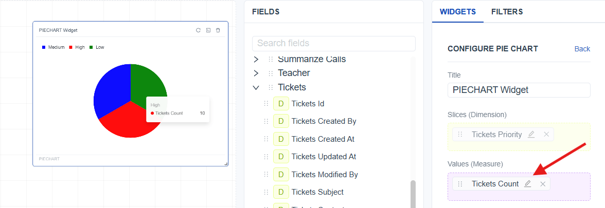
What is Pie Chart
A pie chart displays how different categories contribute to a total. Each slice represents a category’s share, making it useful for understanding proportional distribution within a data set.
How to create a Pie Chart
- Select the Pie chart widget from the Widgets panel to add a blank chart to the report builder. Once selected, the (link to Widget Configuration) Panel for the pie Chart will open automatically, allowing configuration of the chart.

- Add a title to the chart using the Title field in the configuration panel to clearly name the visualization.
-
Resize the chart widget on the builder to fit the required layout (link to widget resize)
-
From the Meta Panel*(link to Meta panel)*, identify the appropriate dimension and value fields needed for the chart.
-
Drag the identified fields into the Widget Configuration Panel (link to widget configuration) by placing:
- Slices (Dimension) : Drag a dimension to define each slice in the pie.
- Values (Measure) : Drag a measure to determine the count shown as slice size
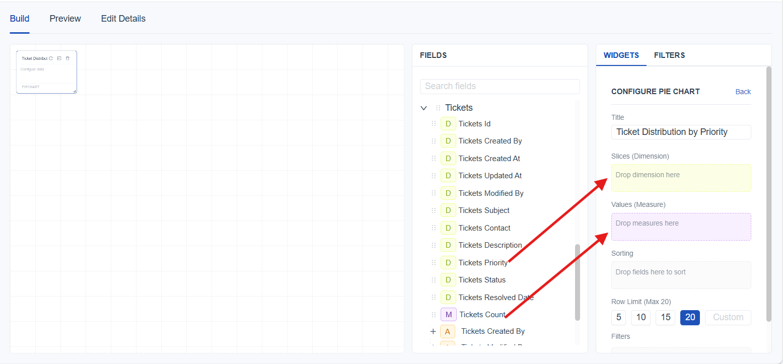
- Save the report using the Save button and switch to Preview Mode for a clearer and more interactive view of the created chart.
Better Understand With a User Scenario
The goal is to understand how many tickets fall under each priority level, making it easier to see which priority contributes the most to the overall workload. By selecting Ticket Priority as the dimension and Ticket Count as the value, the pie chart displays the proportion of tickets in High, Medium, and Low priority groups.

What is Donut Chart
A donut chart displays how different categories contribute to a total, similar to a pie chart, but with a hollow center. This chart type provides a clear visual breakdown of proportions while leaving space in the center.
How to create a Donut Chart
- Select the Donut chart widget from the Widgets panel to add a blank chart to the report builder. Once selected, the (link to Widget Configuration) Panel for the Donut Chart will open automatically, allowing configuration of the chart.

- Add a title to the chart using the Title field in the configuration panel to clearly name the visualization.
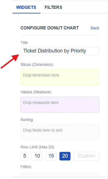
-
Resize the chart widget on the builder to fit the required layout (link to widget layout)
-
From the Meta Panel*(link to Meta panel)*, identify the appropriate dimension and value fields needed for the chart.
-
Drag the identified fields into the Widget Configuration Panel (link to widget configuration) by placing:
- Slices (Dimension) : Drag a dimension to define each slice in the donut.
- Values (Measure) : Drag a measure to determine the count shown as slice size
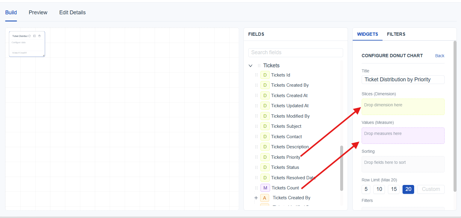
- Save the report using the Save button and switch to Preview Mode for a clearer and more interactive view of the created chart.
Better Understand With a User Scenario
The goal is to understand how many tickets belong to each priority level so that the proportion of workload across High, Medium, and Low priorities is easy to interpret. By selecting Ticket Priority as the dimension and Ticket Count as the value, the donut chart displays each priority category as a slice, showing how much each contributes to the total number of tickets.

What is Sunburst Chart
A sunburst chart visualizes hierarchical data using layered circular segments. Each inner level represents a higher‑level category, while outer rings show how each category breaks down into its sub‑categories. This chart type is ideal for understanding how different levels contribute to the overall structure.
How to create a Sunburst Chart
- Select the Sunburst chart widget from the Widgets panel to add a blank chart to the report builder. Once selected, the (link to Widget Configuration) Panel for the Sunburst Chart will open automatically, allowing configuration of the chart.

- Add a title to the chart using the Title field in the configuration panel to clearly name the visualization.
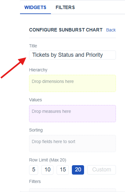
-
Resize the chart widget on the builder to fit the required layout (link to widget layout)
-
From the Meta Panel*(link to Meta panel)*, identify the appropriate dimension and value fields needed for the chart.
-
Drag the identified fields into the Widget Configuration Panel (link to widget configuration) by placing:
- Hierarchy (Dimension) : Drag one or more dimensions to create hierarchy layers
- Values (Measure) : Drag measure to determine the count represented in each segment.
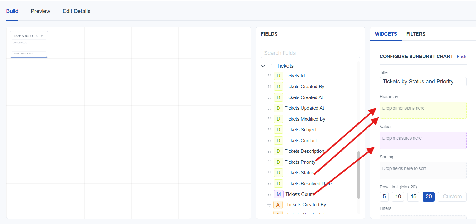
- Save the report using the Save button and switch to Preview Mode for a clearer and more interactive view of the created chart.
Better Understand With a User Scenario
The goal is to understand how tickets are grouped first by status and then by their priority, making it easier to see which combinations contribute the most to the overall ticket count. By selecting Status and Priority as hierarchical dimensions and Ticket Count as the value, the sunburst chart shows the inner ring as status categories and the outer ring as priority breakdowns.
Detailed Data and Exact Values
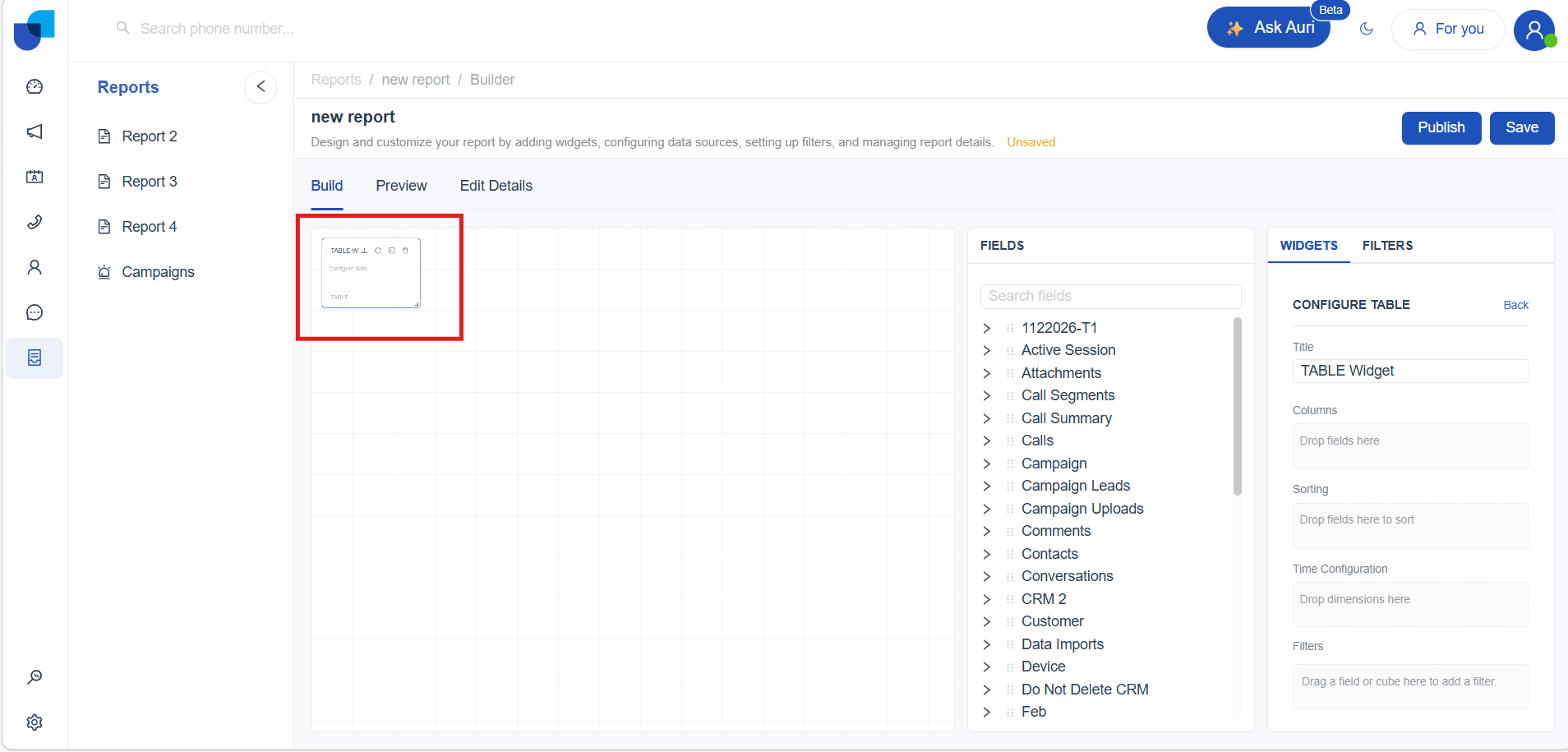
What is Table Widget
A table displays detailed records in a row‑and‑column format. It is useful for viewing exact information, reviewing individual entries, and working with complete data without visual summarization.
How to create a Table
- Select the Table widget from the Widgets panel to add a blank table to the report builder. Once selected, the Widget Configuration Panel for the Table will open automatically.

- Add a title using the Title field in the configuration panel.

-
Resize the table widget on the builder to fit the required layout (link to widget layout).
-
From the Meta Panel (link to Meta panel), identify the fields you want to display.
-
Add the identified fields into the Widget Configuration Panel (link to widget configuration) under:
- Columns : Drag fields to display them as table columns.
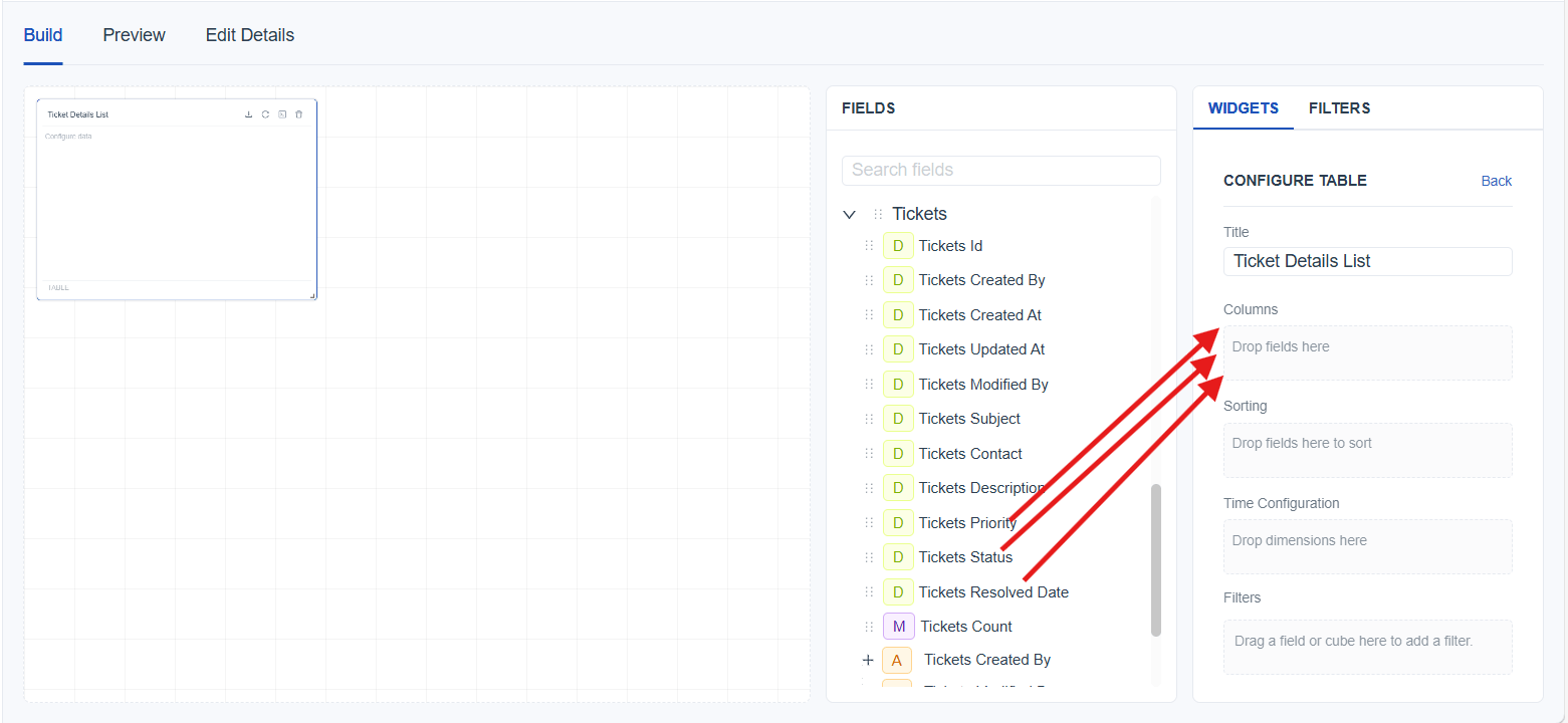
- Save the report using the Save button and switch to Preview Mode for a cleaner view.
[!NOTE] Pagination: The number of records shown per page can be changed using the pagination selector. If the total records exceed the selected amount, the table automatically generates more pages. Navigating forward loads the next page, and extra pages continue to appear as long as there are more records to display.
Column Arrangement: Columns can be reordered by dragging fields up or down inside the Columns section to change how they appear in the table.
Download Current Records: Download the currently visible records in the table using the download button located at the top-right corner of the table. This option is available in both Build Mode and Preview Mode.
Better Understand With a User Scenario
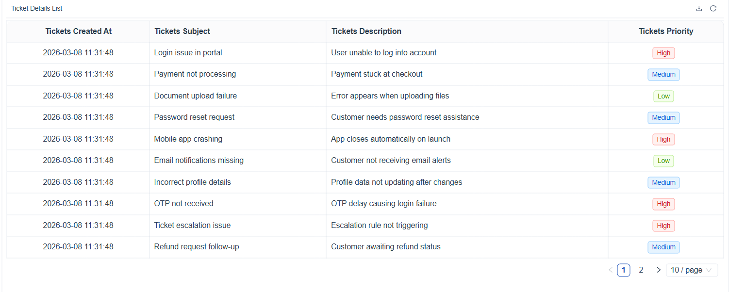
The goal is to view detailed ticket information such as created date, subject, description, priority. By adding these fields to the Columns section, the table shows each ticket as a full record for easy review.
What is Pivot Table Widget
A pivot table summarizes data by grouping values across rows and columns. It is useful for comparing totals, identifying patterns, and analyzing combinations of data categories in a matrix format.
How to create a Pivot Table
- Select the Pivot Table widget from the Widgets panel to add a blank table to the report builder. Once selected, the Widget Configuration Panel for the Table will open automatically.

- Add a title using the Title field in the configuration panel.
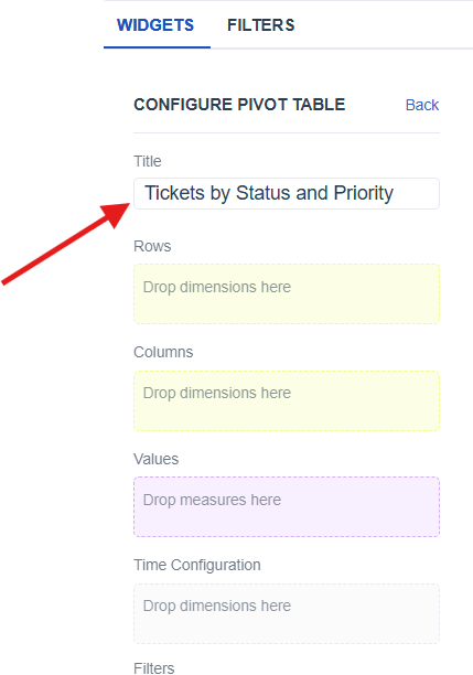
-
Resize the table widget on the builder to fit the required layout (link to widget layout).
-
From the Meta Panel (link to Meta panel), identify the fields you want to group and summarize.
-
Add the identified fields into the Widget Configuration Panel (link to widget configuration) under:
- Rows : Drag one or more dimensions to group data vertically with each field creates an additional level of grouping in the rows.
- Columns : Drag one or more dimension to group data horizontally with each field creates another grouping level in the columns.
- Values : Drag a measure to determine the count used for summarizing.
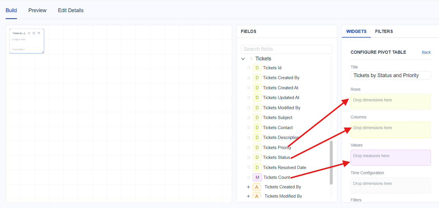
- Save the report using the Save button and switch to Preview Mode for a cleaner view.
[!NOTE] Pagination: The number of records shown per page can be changed using the pagination selector. If the total records exceed the selected amount, the table automatically generates more pages. Navigating forward loads the next page, and extra pages continue to appear as long as there are more records to display.
Column & Row Arrangement: Columns and rows can be reordered by dragging fields up or down inside the Column and row section to change how they appear in the table.
Download Current Records: Download the currently visible records in the table using the download button located at the top-right corner of the table. This option is available in both Build Mode and Preview Mode.
Better Understand With a User Scenario
The goal is to compare ticket counts across different combinations of priority and status. By placing Priority in Rows, Status in Columns, and Ticket Count in Values, the pivot table displays how many tickets fall under each priority–status combination. This makes it easy to identify which priority levels have the most open, in‑progress, or closed tickets.

What is Stat Box
A stat box displays a single summarized value, such as a total count. It is used to highlight important metrics that need quick visibility without showing detailed records or charts.
How to create a Stat Box
- Select the Stat Box widget from the Widgets panel to add a blank table to the report builder. Once selected, the Widget Configuration Panel for the Table will open automatically.

- Add a title using the Title field in the configuration panel.

-
Resize the table widget on the builder to fit the required layout (link to widget layout).
-
From the Meta Panel (link to Meta panel), identify the fields you want to group and summarize.
-
Add the identified fields into the Widget Configuration Panel (link to widget configuration) under:
- Values : Drag a measure to determine the count displayed in the stat box.
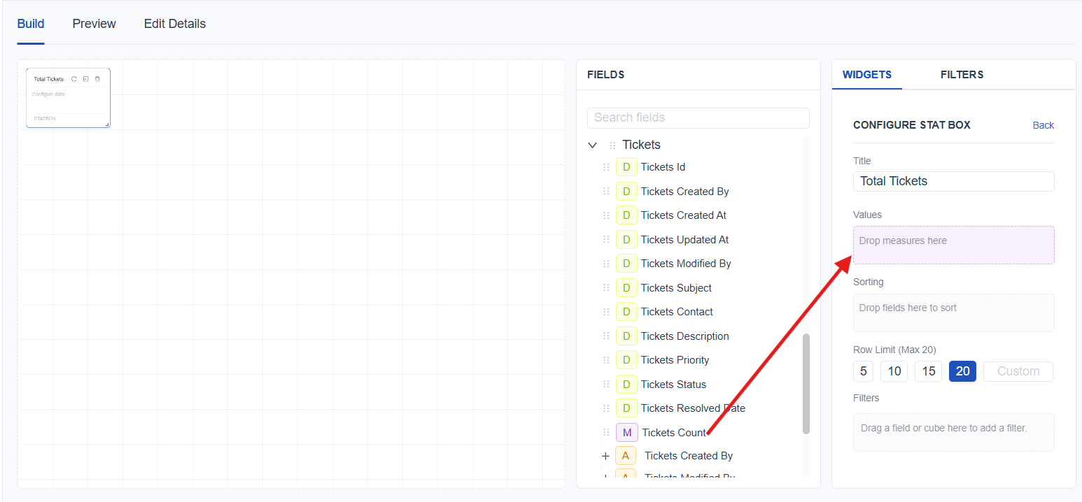
- Save the report using the Save button and switch to Preview Mode for a cleaner view.
Better Understand With a User Scenario
The goal is to display the total number of tickets for quick reference. By selecting Ticket Count as the value, the stat box shows the complete number of tickets available in the data set, giving an instant overview of the overall ticket volume.

Pattern and Density Insights
What is Heatmap
A heatmap displays values across two dimensions using color intensity. It helps identify patterns, high‑activity areas, and low‑activity areas by visually highlighting where counts are higher or lower.
How to create a Heatmap
- Select the Heatmap widget from the Widgets panel to add a blank table to the report builder. Once selected, the Widget Configuration Panel for the Table will open automatically.

- Add a title using the Title field in the configuration panel.
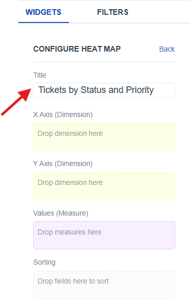
-
Resize the table widget on the builder to fit the required layout (link to widget layout).
-
From the Meta Panel (link to Meta panel), identify the fields you want to group and summarize.
-
Add the identified fields into the Widget Configuration Panel (link to widget configuration) under:
- X Axis : Drag a dimension to represent horizontal categories
- Y Axis : Drag a dimension to represent vertical categories
- Values : Drag a measure to determine the count used for color intensity
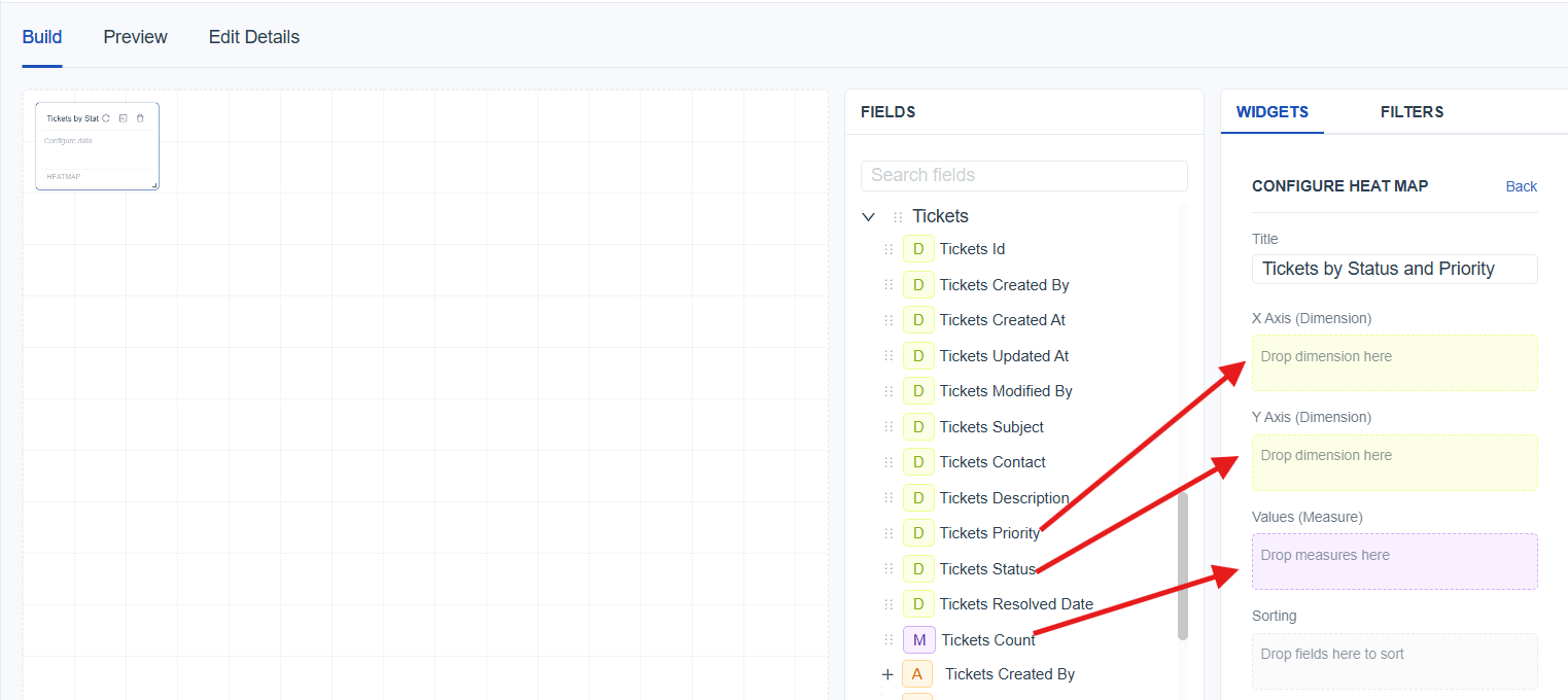
- Save the report using the Save button and switch to Preview Mode for a cleaner view.
Better Understand With a User Scenario
The goal is to display the total number of tickets for quick reference. By selecting Ticket Count as the value, the stat box shows the complete number of tickets available in the data set, giving an instant overview of the overall ticket volume.

Widget Configurations
The Widget Configuration section allows customizing each widget based on the data that needs to be displayed. To configure any widget, drag and drop the required fields into the correct configuration areas. Each widget type supports different configuration options, helping shape the visualization exactly as needed.
| Widget Type | Configurations |
|---|---|
| Table Widget | Columns: Drag fields to display as table columns. |
| Pivot Table Widget | Rows: Drag dimensions to display them as row groups. Columns: Drag dimensions to display column groups. Values: Drag measure to determine the count. |
| Pie Chart Donut Chart | Slices: Drag a dimension to define each slice of the pie. Values: Drag measure to determine the count. |
| Bar Chart | Categories - X Axis: Drag a dimension to define each bar. Values - Y Axis: Drag measure to determine the count. |
| Column Chart Line Chart Area Chart | Categories - X Axis: Drag a dimension to define each vertical column. Values - Y Axis: Drag measure to determine the count. |
| Stat Box | Values: Drag measure to determine the count. |
| Heatmap | X Axis: Drag a dimension to define horizontal categories. Y Axis: Drag a dimension to define vertical categories. Value: Drag measure to determine the count. |
| Sunburst Chart | Hierarchy: Drag dimensions to create multi‑level rings representing hierarchical data. Values: Drag measure to determine the count. |
| Common Configurations | Time Configuration: Drag a time field to convert it into Year, Quarter, Month, Week, Day, Hour, or Minute (link to Time config). Sorting: Drag a field to sort the visualization based on value or category*(link to sorting). Row Limit: Control how many category values are shown in the widget.(link to row limit)* Filters: Drag a field to filter the data before generating the visualization.(link to filters) |
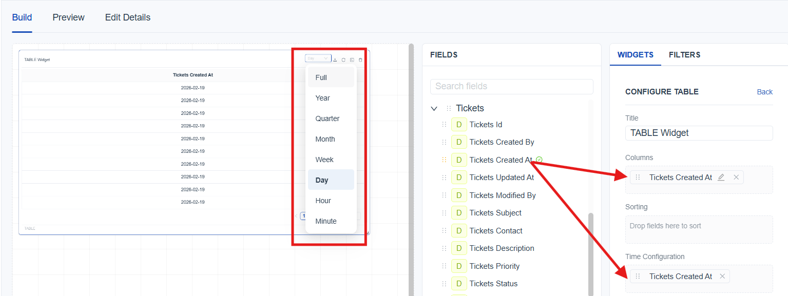
Time Configuration
Purpose
Convert a Date‑Time field into a chosen time level (Year, Quarter, Month, Week, Day, Hour, Minute) so that data can be grouped and visualized by that level.
How Time Configuration Appears in Different Widgets
Table / Pivot
-
A dedicated Time Configuration box is available in the configuration panel.
-
Drag a Date‑Time field in to time configuration box, then choose the required level from the drop down.
[!IMPORTANT] Adding a Date‑Time field to the Time Configuration box only controls how the date is grouped; it does not display the field in the output. To show the date in the widget, add the same field to the display area
Charts
-
Charts do not have a separate Time Configuration box.
-
When a Date‑Time field is added directly into the chart (for example, as an axis, slice, or hierarchy field), a time‑level drop down automatically appears at the top of the widget.
-
From this drop down, you can change how the date is grouped depending on what the chart type supports.
Sorting
Drag a field into the sorting area and select whether the data should be ordered in ascending or descending order.
Row Limit
The Row Limit controls how many category values are shown in a chart. It applies to all chart types except Table and Pivot Table, since those views are meant to display full data sets.
When a chart contains a large number of categories it can become cluttered and difficult to read. The Row Limit helps keep charts clear by showing only the selected number of items.
[!IMPORTANT] The maximum row limit is 20, but you can still view any specific data by using Filters (link to filters)
Better Understand With a User Scenario
Imagine you are analyzing a chart that shows the number of tickets created by different teams. Your system has 30 teams, each represented as a category in the chart. If all 30 are displayed at once, the chart becomes cluttered, labels overlap, and it’s difficult to understand the information at a glance.
To keep the chart clean, you set the Row Limit to 20, which reduces the number of displayed categories and makes the visualization easier to read.
Stacking and Grouping
The Stacking and Grouping features in the Uniconnect Reports Module define how data is visually organized in chart widgets.
-
Grouping displays values as separate bars or lines for each category, allowing easy comparison between categories.
-
Stacking combines multiple values within the same category into a single bar or area, visually breaking it down into segments.
Stacking and Grouping can be applied only to the following widget types:
- Bar Chart
- Column Chart
- Line Chart
- Area Chart
To Configure Stacking or Grouping:
-
Select the required widget.
-
Configure the Y axis and X axis.
-
Drag and drop the required dimension into the Split By / Stack (Dimension) field to define how the data should be split or grouped.
-
In the Split Mode drop down, select either Group or Stack to define how the selected dimension should be displayed within the widget.
Better Understand With a User Scenario
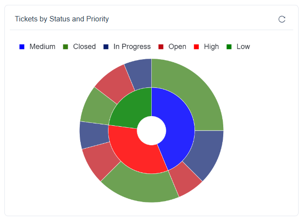
Imagine you are analyzing a chart that shows the number of tickets based on priority levels such as High, Medium, and Low. While this gives a clear view of how many tickets exist in each priority, it does not show the current status of those tickets, such as Open, In Progress, or Closed. To gain deeper insight, you use the Split By / Stack (Dimension) option and select Ticket Status. By setting the Split Mode to Stack, each priority column is divided into segments representing different statuses.
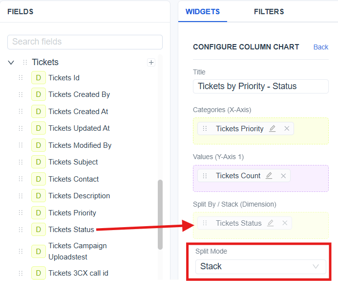
The configured chart will appear as shown below:

Filters
Filters allows to narrow down data by including only the values you want to see.
To add a filter, drag a field or cube into the Filters area and configure the criteria.
There are two types of filters to use:
-
Widget Filter – applies only to the selected widget
-
Global Filter – applies across the entire report
Learn more on filters: (link to filters)
Tool Tip Configuration
Defines the label shown inside the chart tool tip when hovering over any widget. This helps to understand what value is being displayed for each segment. You can edit and customize this tool tip label directly from the configuration panel.
Widget Layout
Allows to move and resize widgets within the builder to customize the report layout according to the needs.
To Move a Widget:
-
Hover over the widget header.
-
When hovering over the widget header, the cursor changes to a move icon.
-
Drag the widget to the desired position.
-
Release to place it.
To Resize a Widget:
-
Hover over the bottom‑right corner of the widget until the resize handle appears
-
Click and drag the resize handle.
-
Adjust the size as needed.
-
Release to apply the new size.
Filters
Filters in Uniconnect reports help refine and control the data displayed within reports. Applying filters allows reports to present focused and relevant data sets based on selected criteria.
Uniconnect reports support two types of filters:
-
Widget Filters
-
Global Filters
[!NOTE] Multiple filters can be applied simultaneously to further narrow down results. This behavior applies to both widget filters and global filters.
Widget Filters
A widget filter is used to control and refine the data displayed within a specific report widget. Widget filters are configured at the widget level and affect only the selected widget, without impacting other widgets within the same report.
Widget filter Configuration
-
Widget filters are configured directly from the Build tab. When a widget is selected, the widget configuration panel opens automatically.
-
Drag the required field into the Filter box and configure the filter conditions.
- To remove an applied filter, click Remove next to the filter field. After removing the filter, the widget data is reset and displays results without the applied filter conditions.
Global Filters
Global filters are used to apply filtering conditions across an entire report. Once applied, global filters affect all report widgets that support the selected filter criteria, ensuring consistent data filtering throughout the report.
Where Global Filters Can be Configured and Applied
Configuration
-
Global filters are configured only in the Build tab.
-
Configuration is performed from the Filters tab within the Build panel.

-
Drag the required fields into the global filter area and click Apply to apply the configured global filters and update data across all supported widgets.
-
Clear Applied : Clear all applied global filter values while keeping the configured global filters
-
Remove : Delete the configured global filter; after removal, report data is reset and displayed without the removed filter.
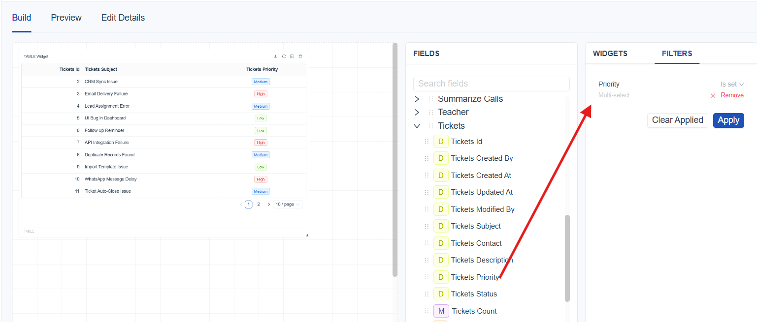
Application
Configured global filters can be applied from the following modes:
- Build Mode
- Preview Mode
- Published Mode
Filter Types
[!NOTE] Available filter types depend on the selected field and its underlying data type.
| Filter Category | Filter Type | Explanation |
|---|---|---|
| Text Filter | Is set | Filters records where the selected field contains any value. |
| Is not set | Filters records where the selected field is empty | |
| Equals | Filters records where the field value exactly matches the specified text. | |
| Not Equals | Filters records where the field value does not exactly match the specified text. | |
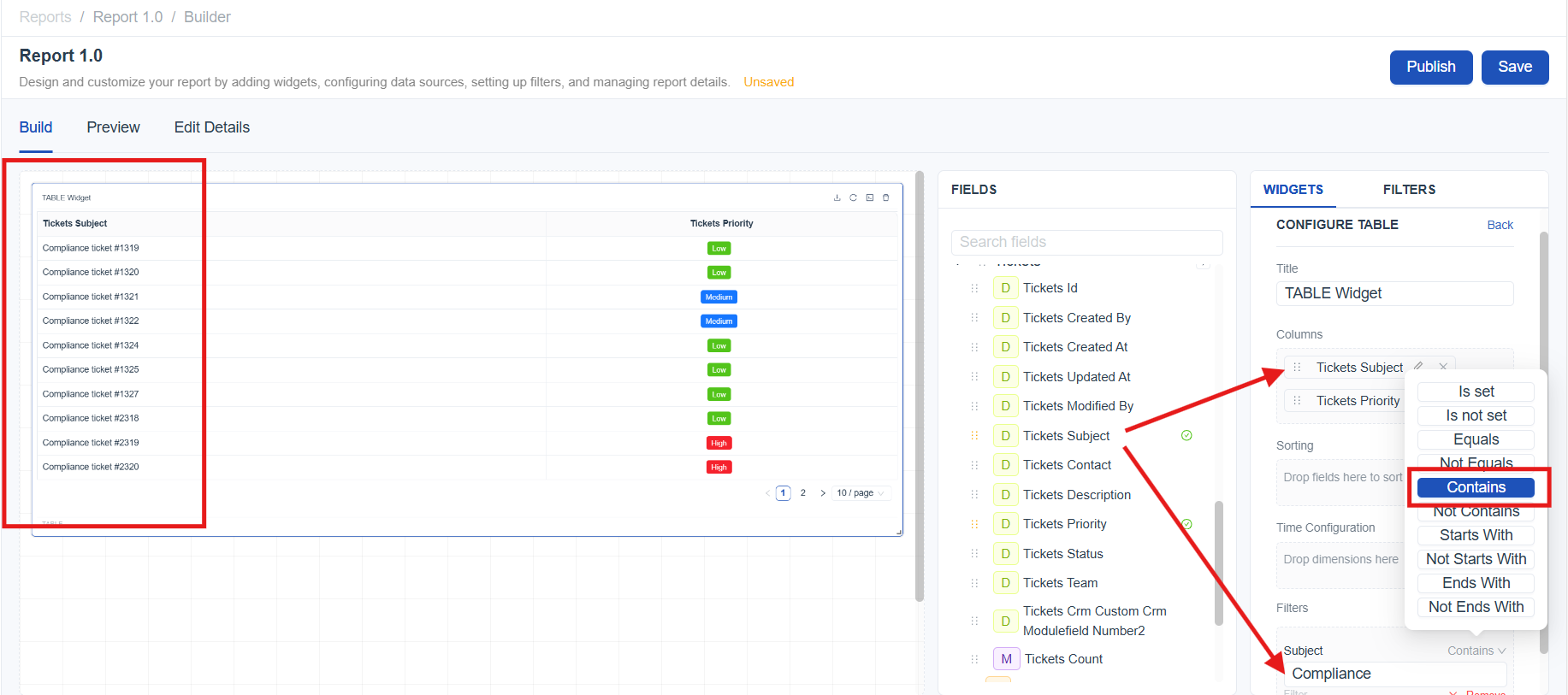
| Contains | Filters records where the field value includes the specified text. | |
| Not Contains | Filters records where the field value does not include the specified text. | |
| Starts With | Filters records where the field value begins with the specified text. | |
| Not Starts With | Filters records where the field value does not begin with the specified text. | |
| Ends With | Filters records where the field value ends with the specified text. | |
| Not Ends With | Filters records where the field value does not end with the specified text. | |
| Numeric Filter | Is set | Filters records where the selected numeric field contains any value. |
| Is not set | Filters records where the selected numeric field is empty or not populated. | |
| Equals | Filters records where the numeric field value exactly matches the specified number. | |
| Not Equals | Filters records where the numeric field value does not match the specified number. | |
| Greater Than | Filters records where the numeric field value is greater than the specified number. | |
| Less Than | Filters records where the numeric field value is less than the specified number. | |
| Greater Than Equal | Filters records where the numeric field value is greater than or equal to the specified number. | |
| Less Than Equal | Filters records where the numeric field value is less than or equal to the specified number. | |
| Between | Filters records where the numeric field value falls within the specified range. | |
| Enum Filter | Is set | Filters records where the selected Enum field contains any value. |
| Is not set | Filters records where the selected Enum field is empty or not populated. | |
| Equals | Filters records where the Enum field value matches one or more selected values. | |
| Not Equals | Filters records where the Enum field value does not match one or more selected values. | |
| Date Filter | Today | Filters records with dates matching the current date. |
| Yesterday | Filters records with dates matching the previous date. | |
| This Week | Filters records with dates within the current calendar week. | |
| This Month | Filters records with dates within the current calendar month. | |
| This Year | Filters records with dates within the current calendar year. | |
| Last Week | Filters records with dates within the previous calendar week.(Mon - Sun) | |
| Last Month | Filters records with dates within the previous calendar month. | |
| Last Year | Filters records with dates within the previous calendar year. | |
| Last 7 Days | Filters records with dates from the last 7 days, including the current date. | |
| Last 30 Days | Filters records with dates from the last 30 days, including the current date. | |
| Last 12 Months | Filters records with dates from the last 12 months, including the current date. | |
| Custom | Filters records based on a user-defined start and end date and time. |
User Scenarios for Filter Types
Text Filter (Contains)
The goal is to focus on tickets related to a specific issue type by filtering ticket subjects that include a particular keyword. By applying a Text Filter with the “Contains” condition on the Ticket Subject field and entering the keyword “compliance”, the report displays only tickets whose subject includes that term. This makes it easy to quickly identify and analyze all compliance‑related tickets.
Numeric Filter (Greater Than)
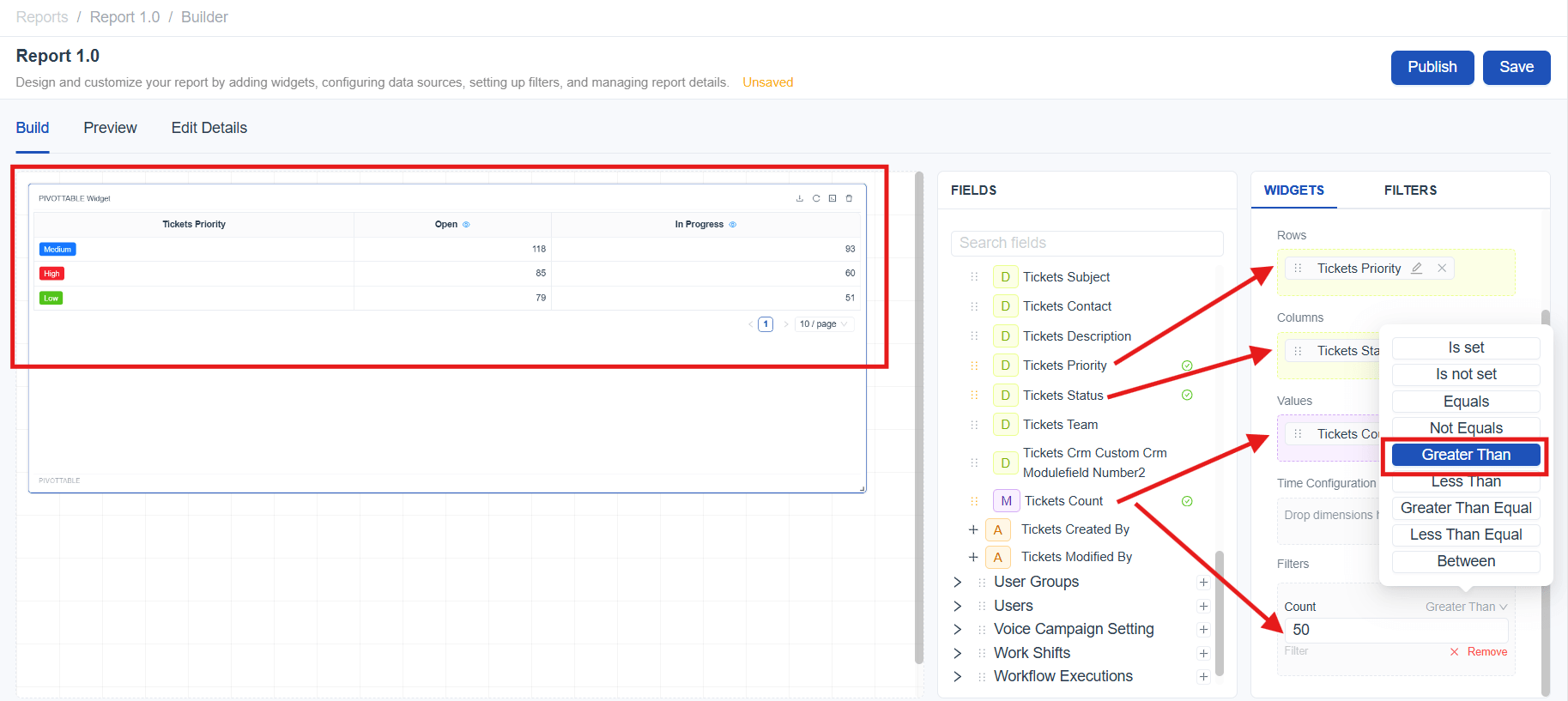
The goal is to identify priority–status combinations with a high volume of tickets that may require immediate attention. By placing Priority in Rows, Status in Columns, and Ticket Count in Values, the pivot table displays the number of tickets for each priority and status combination. Applying a Numeric Filter with the “Greater Than” condition on Ticket Count and setting the value to 50 ensures that only combinations with more than 50 tickets are displayed.
Report Publish and Export
Enum Filter (Equals)
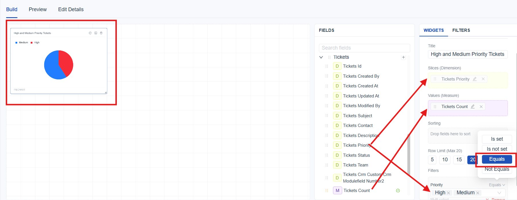
The goal is to analyze the distribution of tickets by priority. By configuring a Pie Chart with Ticket Count as the measure and Priority as the category, the chart visualizes how tickets are distributed across different priority levels. Applying an Enum Filter with the “Equals” condition on the Priority field and selecting multiple values such as High and Medium ensures that the chart displays only tickets with those selected priorities.
Date Filter (Custom)
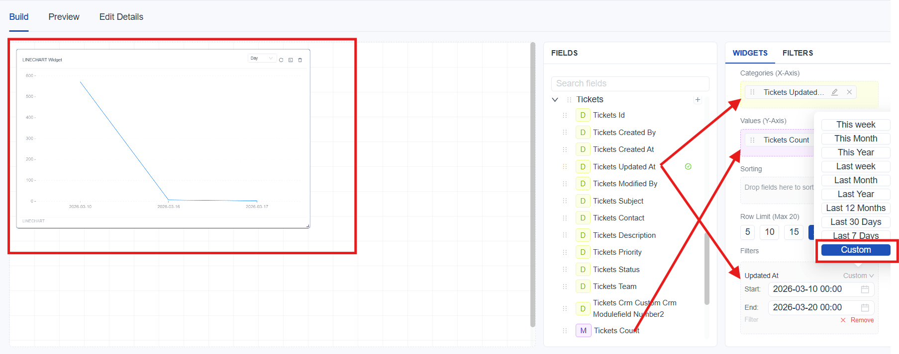
The goal is to analyze ticket activity within a specific time period based on recent updates. By configuring a chart with Ticket Count as Y axis and Updated At as the X axis, the report displays ticket trends over time. Applying a Date Filter with the “Custom” condition on the Updated At field and setting the date range from 03/10 to 03/20 ensures that only tickets updated within this period are included.
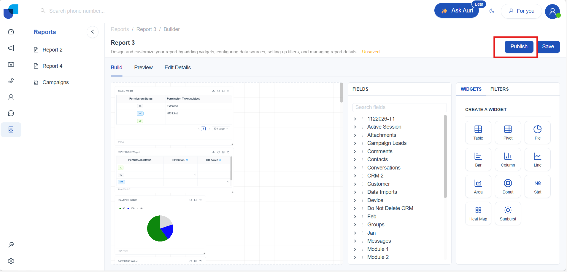
How to Publish a Report
If you have the required permissions (link to permission), you can publish the report so it becomes visible to other users.
Here’s how to publish:
- Open the report you want to share.
- Click Publish.
Once published:
- The report becomes visible to all authorized users.
- It automatically appears in the left sidebar report list.
- A green check‑mark icon indicates it is published.
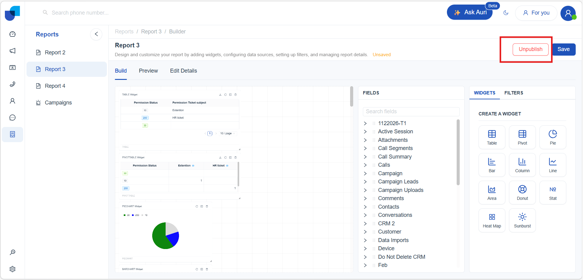
To unpublish:
- Open the report and go to Edit mode
- Click Unpublish, The report will no longer be visible to other users.
How to Export a Report
All published reports in Uniconnect can be downloaded as a PDF file. The export option allows sharing and offline access to report data in a standardized format.
-
Navigate to the Published Reports list.
-
Select the required published report.
-
Click Download PDF to export the report.
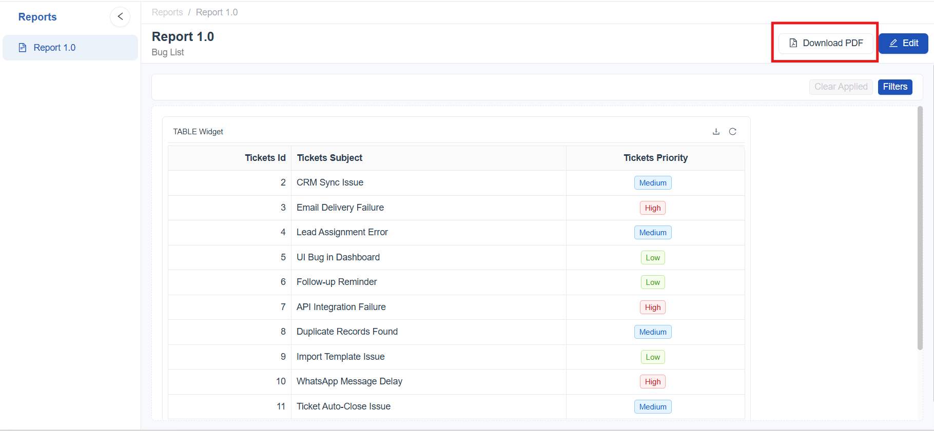
Once downloaded, the report is available as a PDF file for viewing and sharing.
[!IMPORTANT] For table and pivot table reports, only the records currently displayed in the report are included in the downloaded PDF. The number of records included in the export can be adjusted using the pagination selector before downloading the report.