How to Configure Layouts
Layouts control how a module's fields actually get arranged on screen: which fields are grouped together, in what order, and inside what kind of container. Every module's Layout Builder tab starts empty, and each layout gets built from scratch. This page walks through the specific settings inside all four layout types, using the Products module as the example throughout.
The Layout Builder is part of the Custom CRM Modules capability, available from Starter and above.
Layouts only control arrangement, not behavior. The Category → Subcategory auto-fill and the Primary Contact relationship used as examples throughout this page come from that module's own Dependencies tab, a separate part of module configuration covered in Configuring CRM Dependencies. A dependency keeps working the same way no matter which layout, or which section within a layout, its fields end up placed in.
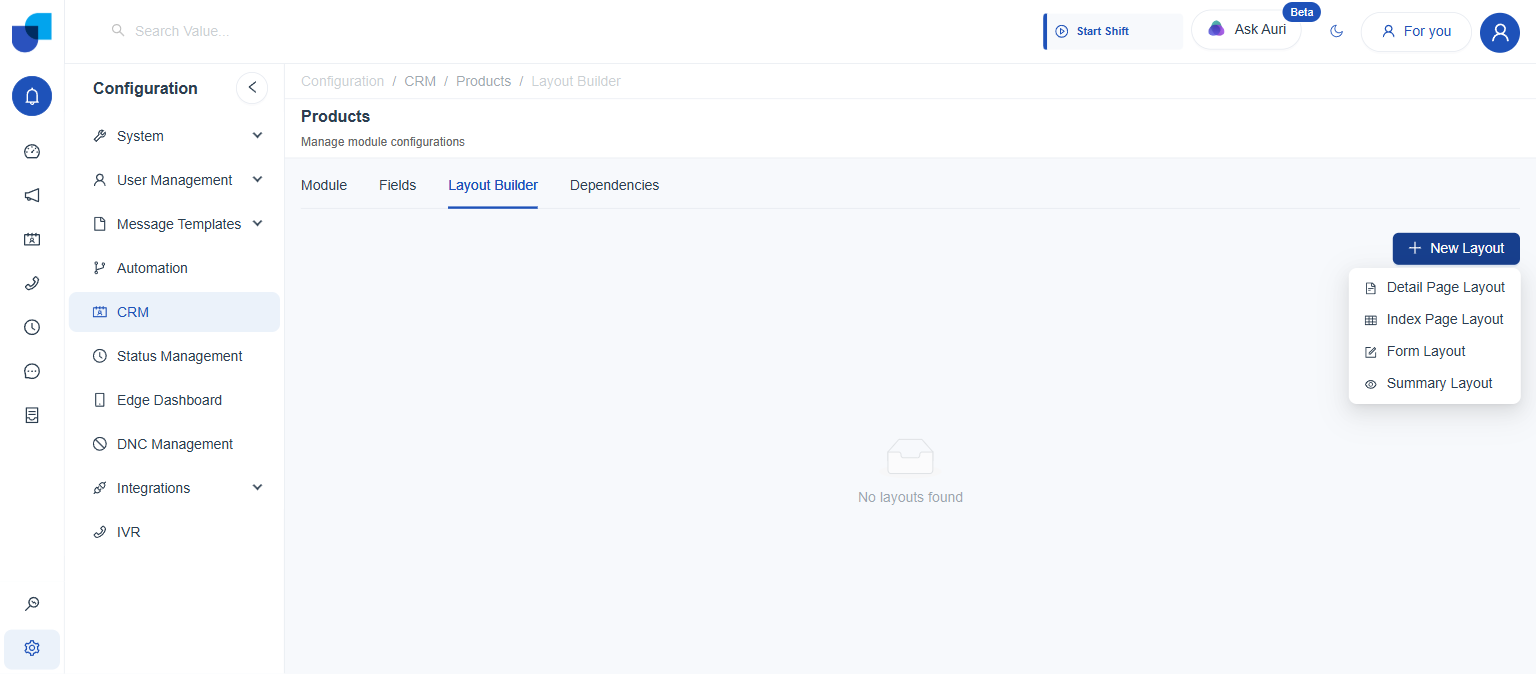
The Four Layout Types
Clicking New Layout offers a choice of four, each meant for a different screen, and each with its own distinct settings, covered one by one below.
| Type | Used for |
|---|---|
Detail Page Layout | The full record view: everything visible when a single record is opened. |
Index Page Layout | The list/table view showing many records at once. |
Form Layout | The create/edit form used when adding or updating a record. |
Summary Layout | A condensed view, such as a preview card or panel referencing the record from elsewhere. |
Detail Page Layout
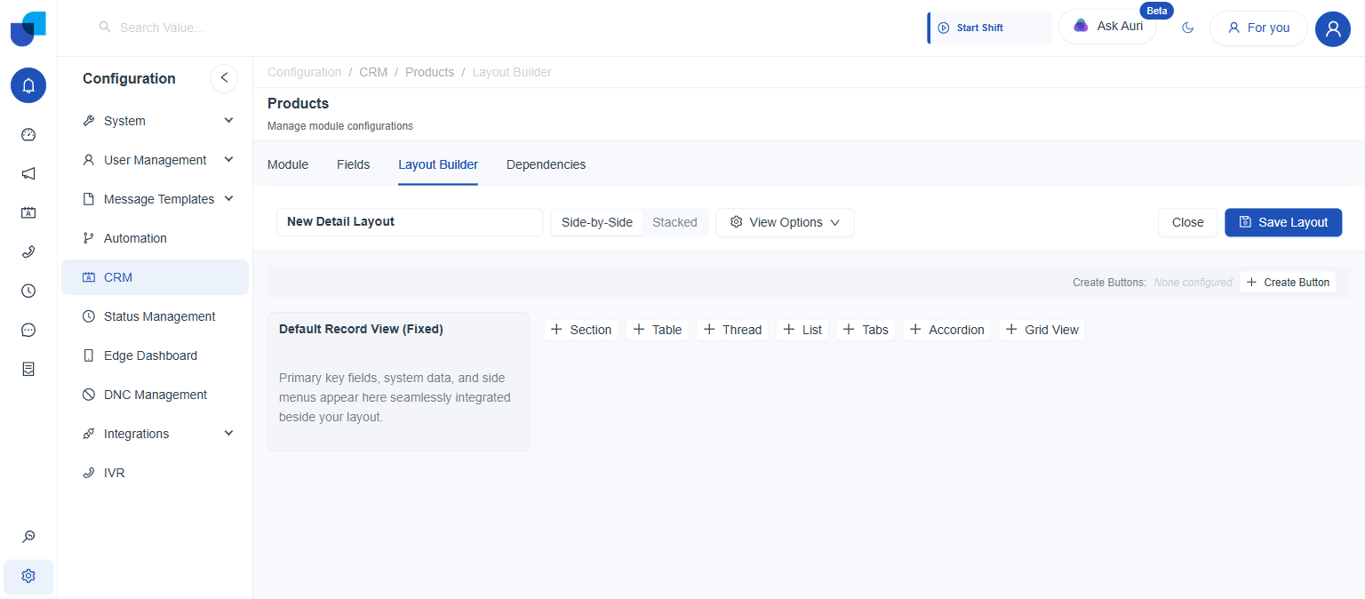
Choosing Detail Page Layout opens a blank canvas: a name, a base shape, and a row of block buttons to build the page one piece at a time.
| Setting | What it does |
|---|---|
Layout Name | Labels the layout in the saved list, e.g. "Product Detail." |
Side-by-Side / Stacked | The base column arrangement for whatever blocks get added. |
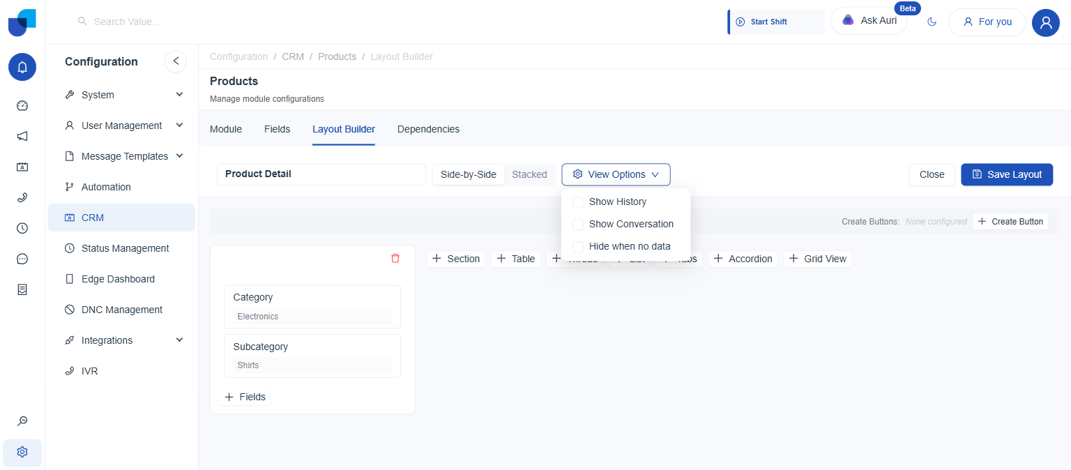
View Options | Show History, Show Conversation, and Hide when no data, each an independent checkbox. |
Create Buttons
Create Buttons add standalone buttons to the top of the detail view, each opening a blank form for a different module.
- Click + Create Button. Located above the blocks, next to a "Create Buttons:" label that reads None configured until at least one module is added.
- Pick one or more modules. Select Modules opens a list of every other module in the system.
- Click OK.
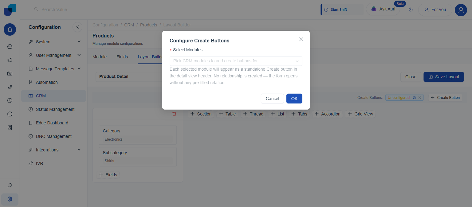
"Each selected module will appear as a standalone Create button in the detail view header. No relationship is created, the form opens without any pre-filled relation."
Each module picked becomes its own removable chip next to the Create Buttons label, with a settings (gear) icon to reopen Select Modules and a × to drop that one module:
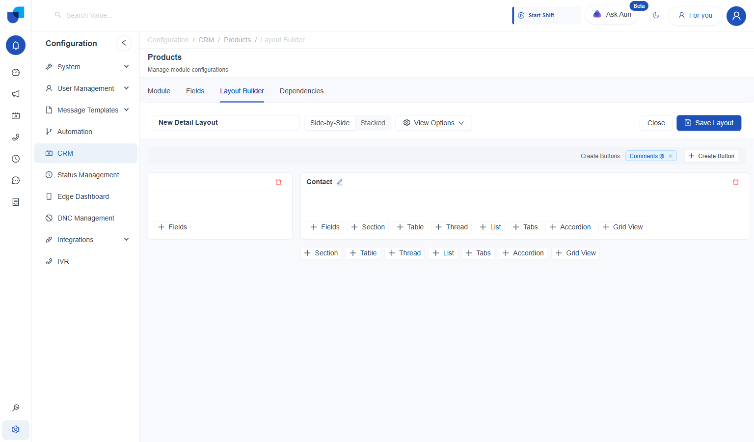
Comments added as a Create Button; + Create Button stays available to add more.
Blocks
Every block is a container for content, added from the same row of buttons wherever it appears, including nested inside a Table's row expansion or a Tabs panel.
| Block | Holds |
|---|---|
Section | A plain group of fields, added directly with + Fields. |
Table | A tabular list, of either a related module or a non-related one. |
Thread | A running feed pulled from a related module, such as comments. |
List | A vertical list of related records shown as cards. |
Tabs | Multiple panels switched between by tab, each able to hold its own blocks. |
Accordion | Collapsible stacked panels. |
Grid View | An activity feed linked to another CRM module. |
Section
The simplest block: a plain group of fields, and the only block type that renders directly on a Products record right now.
- Add the block. Click Section from the block row. An empty Section block appears, blank apart from a red delete (trash can) icon in its top right corner and a + Fields control lower down.
- Click + Fields. Opens a field picker scoped to this module.
- Pick the fields. Selecting one or more fields, e.g. Category and Subcategory, adds them to the section immediately, previewed with sample values.
- Click Save Layout.
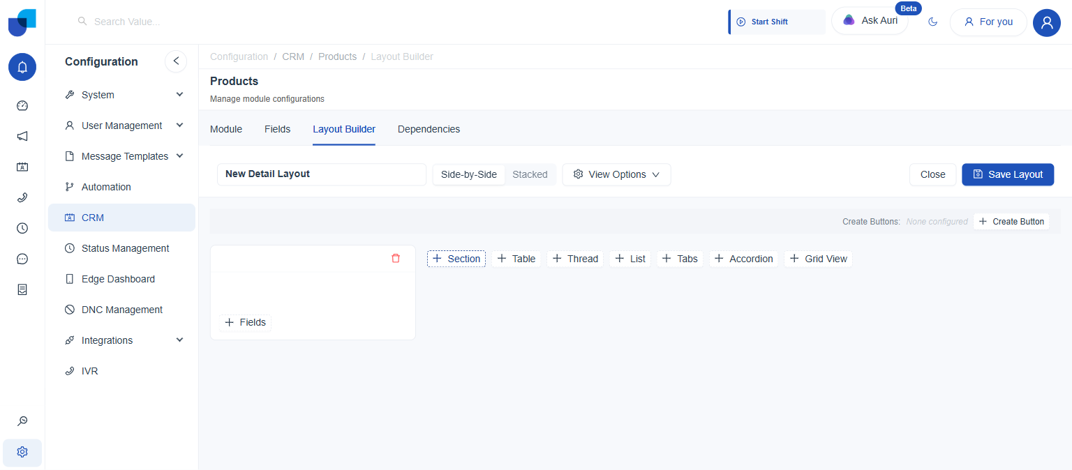
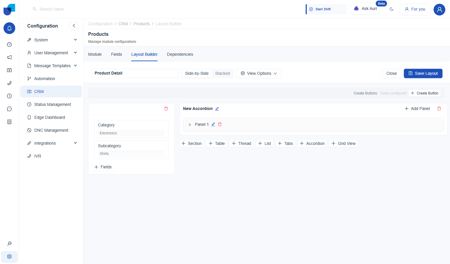
That red delete icon isn't unique to Section: every block type carries one in its top right corner. Clicking it asks "Delete this section?" (or the matching name for that block type) with Cancel and OK, so nothing is removed until OK is confirmed.
On the record page itself, a Show empty fields switch is located below the section's own fields, off by default. With it off, any field carrying no value is left out entirely rather than shown blank.
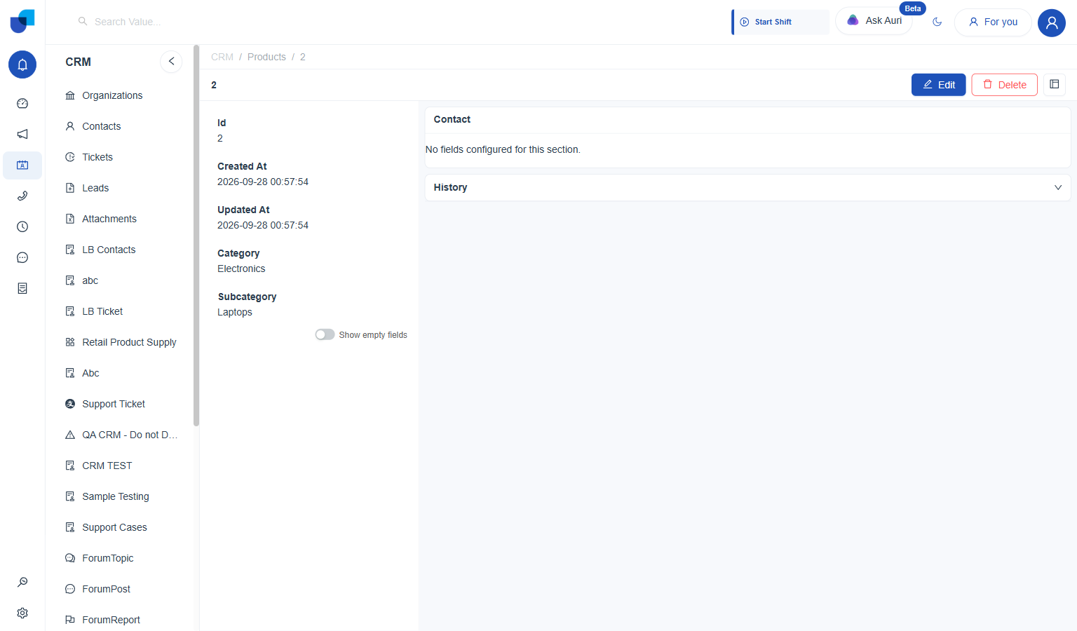
Off: Created By, Modified By, and Primary Contact are left out since this record has no value for them.
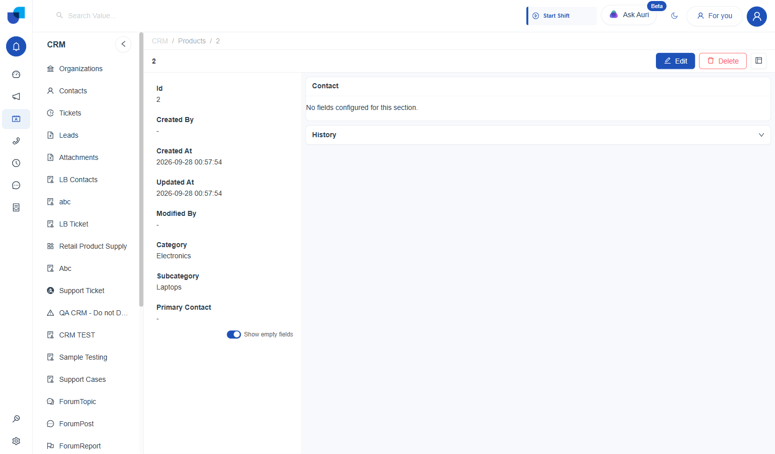
On: the same fields reappear, each showing a dash where no value is set.
This switch is a per-viewer preference on the record page, not a Layout Builder setting. It cannot be turned on by default for everyone from the builder; each person toggles it for themselves.
Table
Shows a tabular list inside the detail view, either of records related to the one being viewed, or of any other module entirely.
- Add the block. Click Table from the block row. A New Table block appears with a Select Table control.
- Open Configure Table. Click Select Table (or Configure, once already set) to open the dialog.
- Pick a Module Type.
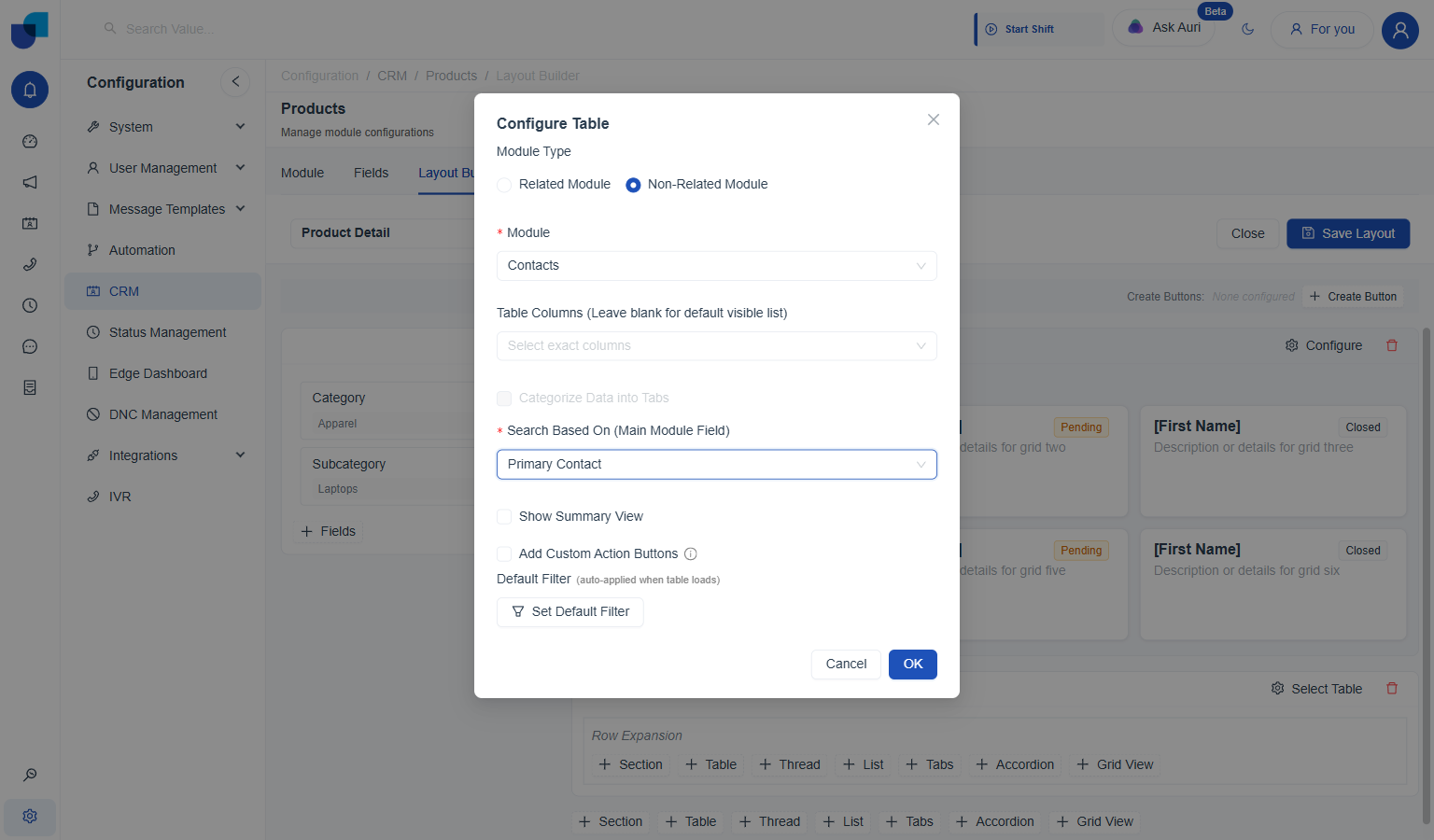
Related Modulelists records from a module that already has a relationship pointing at this one.Non-Related Modulelists any module's records instead, matched manually against a field on this record. - Fill in the fields that appear. Related Module asks for a Related Module List. Non-Related Module asks for a Module and a Search Based On (Main Module Field), the field on this record used to filter that other module's list.
- Set the rest, optionally. Table Columns picks exact columns (blank keeps the default visible list); Show Summary View adds a condensed summary; Add Custom Action Buttons and Categorize Data into Tabs unlock once a related module is set; Default Filter auto-applies a filter whenever the table loads.
- Click OK, then Save Layout. The block keeps whatever was configured; Save Layout commits it to the record page.
On Products, no other module has a relationship pointing back at it yet, so Related Module List has nothing to offer. Non-Related Module works around that: picking Contacts as the Module and Primary Contact as Search Based On shows the Contact this Product actually points to, filtered by that field instead of a two-way relationship:
Thread
Shows a running feed of records from a related module, styled like a comment thread.
- Add the block. Click Thread from the block row. A New Thread View block appears.
- Click Configure. Opens Configure Thread View.
- Pick the Related Module. Only modules with an existing relationship pointing at this one are offered here; unlike Table, Thread has no non-related fallback.
- Map Avatar, Title, and Content. Avatar sets the field used as each entry's avatar/initials, Title the author or heading field, Content the message body field.
- Click OK, then Save Layout.
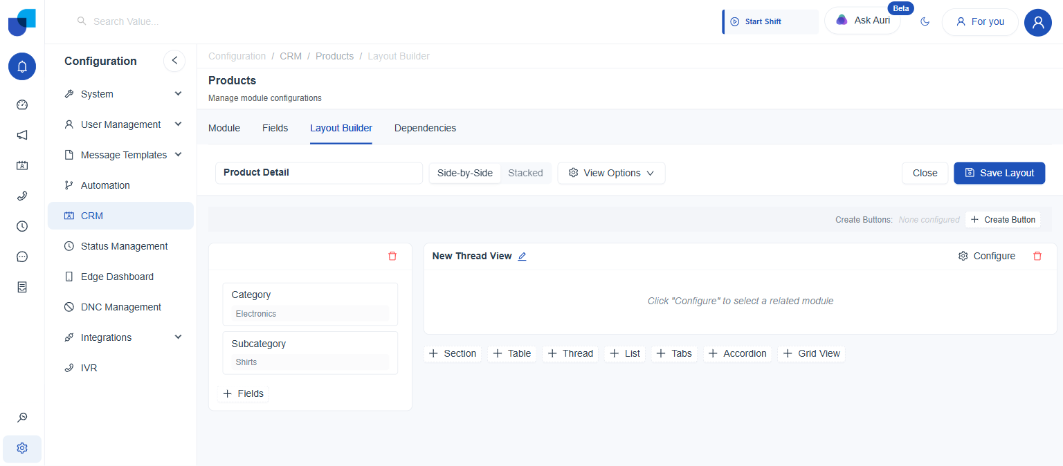
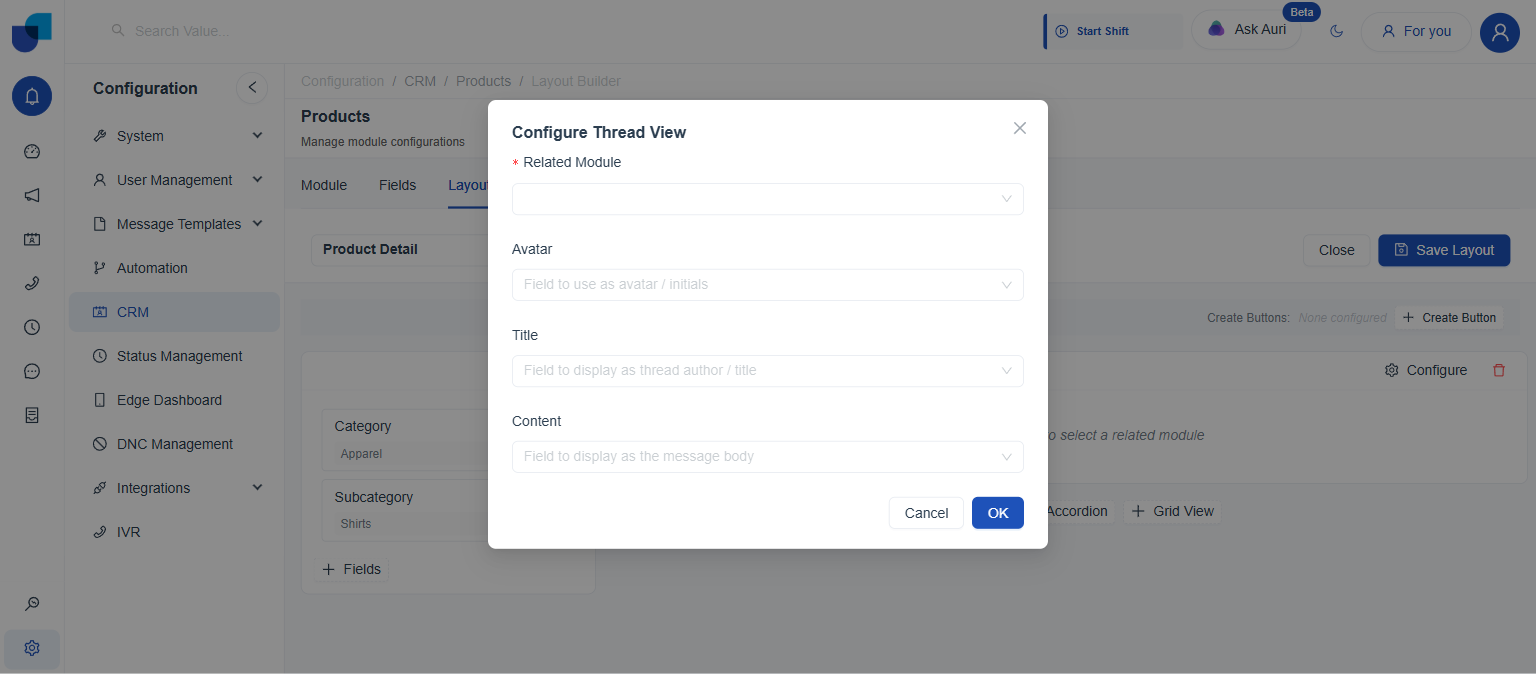
On Products, Related Module comes back empty: no other module has a relationship field pointing at Products yet, and Thread, unlike Table, has no way to work around that. A Thread only becomes usable here once such a relationship exists, e.g. a Comments-style module built to reference Products directly.
List
Shows related records as a vertical list of cards rather than a table.
- Add the block. Click List from the block row. A New List View block appears.
- Click Configure. Opens Configure List View.
- Pick the Related Module. Same restriction as Thread: only modules already related to this one are offered, with no non-related option.
- Map Title, Description, Avatar, and Status. Title is the card's primary display field, Description a secondary/subtitle field, Avatar the card's avatar field, Status the field shown as a status badge.
- Click OK, then Save Layout.
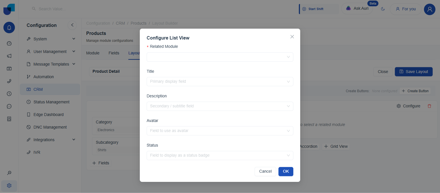
Same story as Thread: Related Module comes back empty on Products until another module has a relationship pointing at it.
Tabs
Splits content into switchable panels. Each tab gets its own independent row of block buttons, so a single Tabs block can hold a Section in one tab and a Table in another.
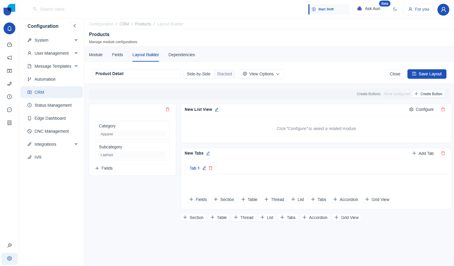
- Add the block. Click Tabs from the block row. A New Tabs block appears with one tab already in it, Tab 1.
- Add more tabs, as needed. Add Tab, next to the block's own title, appends another one.
- Rename each tab. The pencil icon next to a tab's label opens an Edit Name dialog with a single Label field.
- Add content inside each tab. Selecting a tab reveals its own + Fields / Section / Table / Thread / List / Tabs / Accordion / Grid View row, completely independent of every other tab's content.
- Click Save Layout.
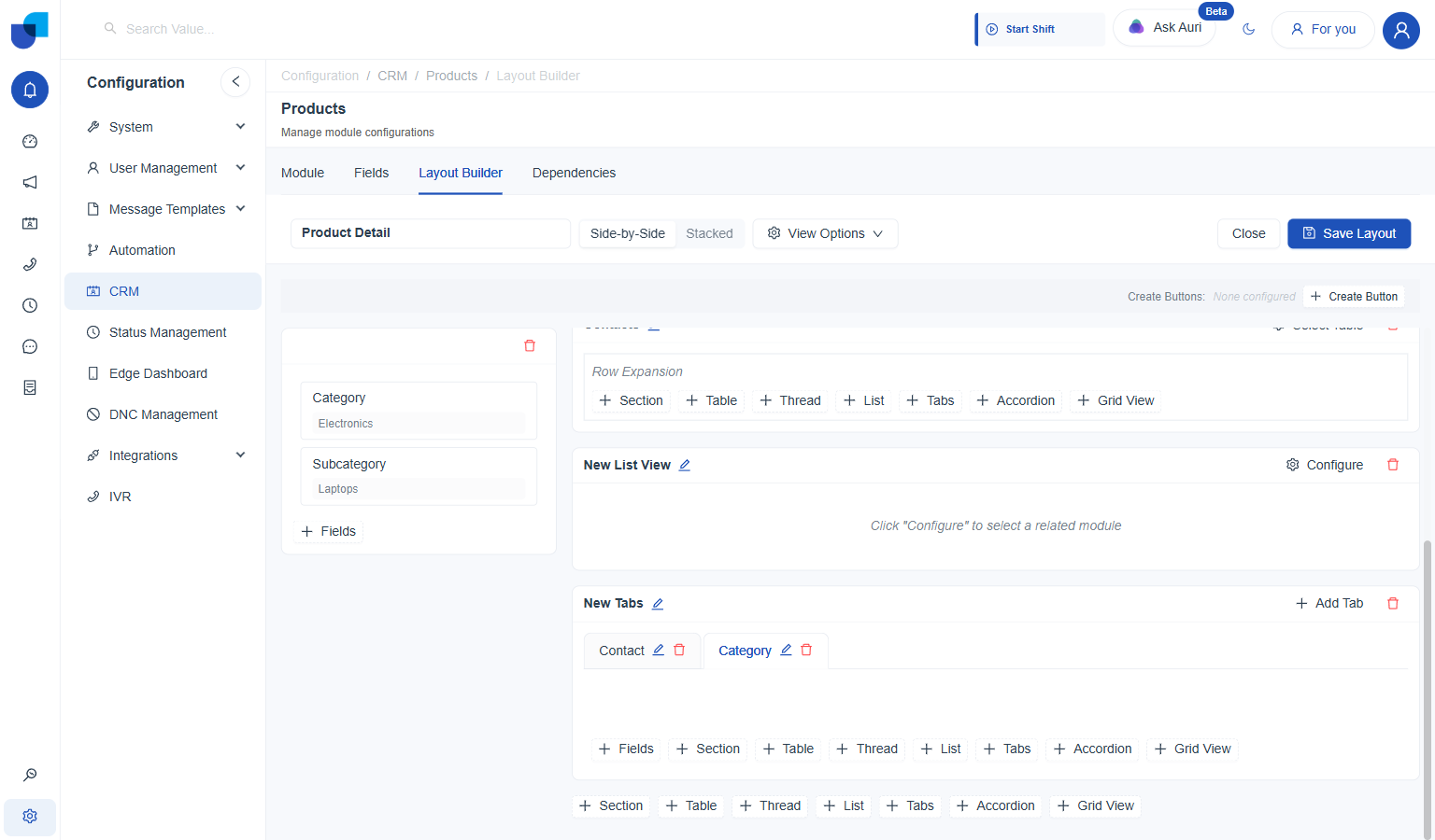
On Products, renaming Tab 1 to Contact and the second tab to Category, then adding the Primary Contact field to the first and Category/Subcategory to the second, gives two purpose-named tabs on the one block:
Accordion
Stacks content into collapsible panels instead of side-by-side tabs. Each panel expands or collapses independently and can hold its own blocks, the same as a Tabs panel.
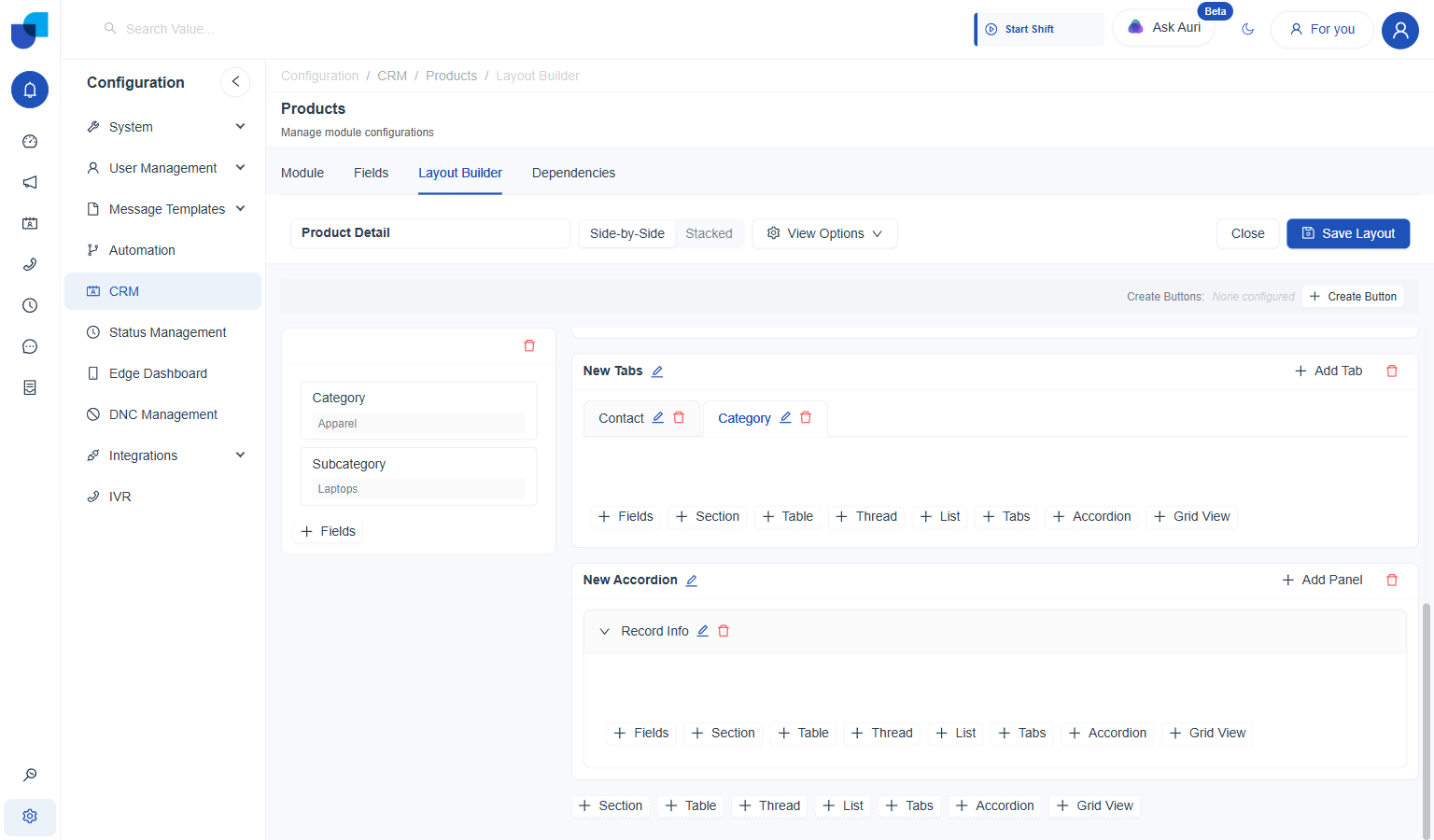
- Add the block. Click Accordion from the block row. A New Accordion block appears with one collapsed panel, Panel 1.
- Add more panels, as needed. Add Panel, next to the block's own title, appends another one.
- Expand a panel to work on it. Clicking the panel header toggles it open; it stays open while blocks get added inside.
- Rename the panel. The pencil icon next to its label opens the same Edit Name dialog Tabs uses.
- Add content inside. An expanded panel gets its own + Fields / Section / Table / Thread / List / Tabs / Accordion / Grid View row.
- Click Save Layout.
On Products, Panel 1 renamed to Record Info and filled with the Id and Created At fields:
Grid View
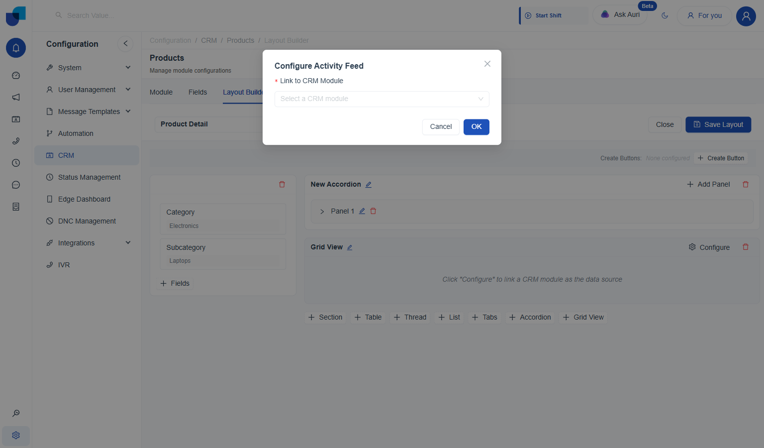
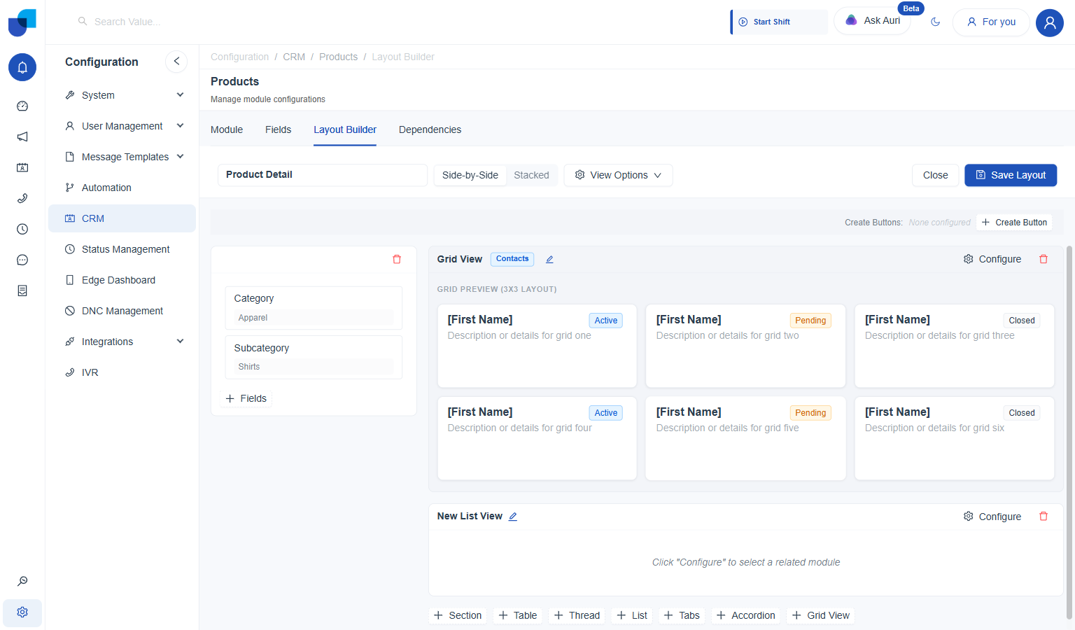
Despite the name on the block button, this configures as an activity feed: it links the record to another CRM module and shows that module's related activity as a grid of cards.
- Add the block. Click Grid View from the block row. It opens straight into Configure Activity Feed.
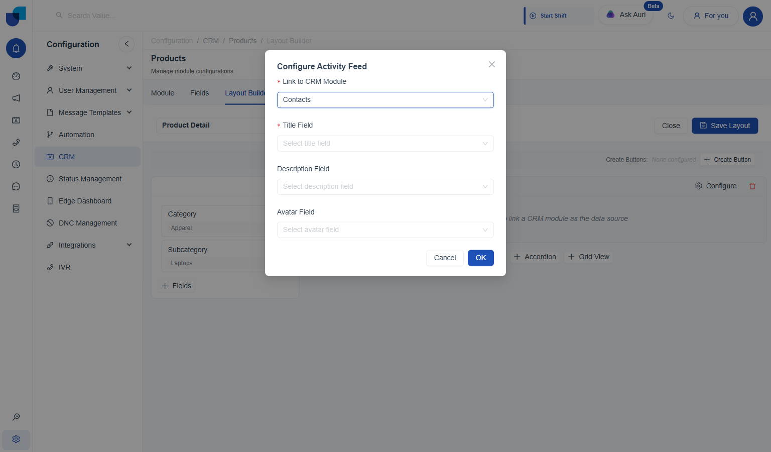
- Pick Link to CRM Module. Only modules already related to this one are offered, the same as Table's Related Module option.
- Map Title Field, and optionally Description and Avatar. Title Field is required; Description Field and Avatar Field are optional extras shown on each card.
- Click OK, then Save Layout.
On Products, Link to CRM Module offers Contacts, since Primary Contact already relates the two. Setting Title Field to First Name completes it:
Once configured, the block previews a 3×3 grid of placeholder cards right in the builder, before any layout gets saved:
Index Page Layout
Controls the list screen that shows many Products records at once. Unlike the Detail layout, this one has a single fixed shape with its own settings rather than a block picker.
| Setting | What it does |
|---|---|
Layout Name | Labels the layout in the saved list. |
View type | Table, List, Grid, or Kanban: the base shape the list renders in. |
Table Columns | Which fields appear as columns, added one at a time. |
Default Filter | A filter auto-applied every time the list loads, configured per field. |
- Open the builder. New Layout → Index Page Layout opens directly into an empty builder, no intermediate dialog.
- Name it and pick a view type. Layout Name labels it in the saved list; Table, List, Grid, or Kanban sets the base shape.
- Add columns, one at a time. Table Columns opens a picker; each field added appears immediately in the live preview on the right, against real records.
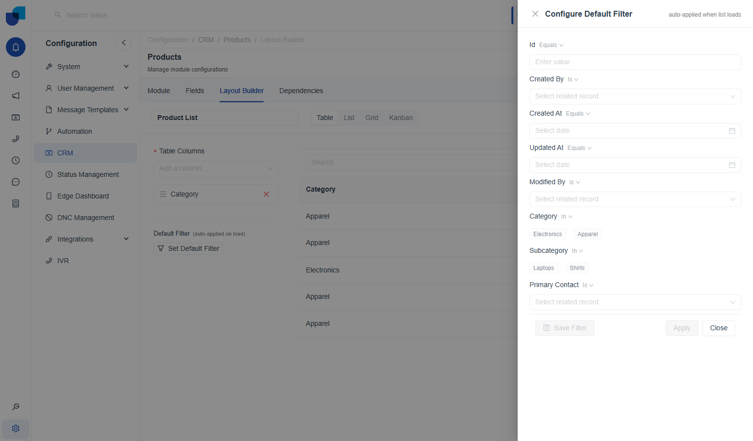
- Set a Default Filter, optionally. Set Default Filter opens a panel covering every field on the module, each with its own operator and value, auto-applied whenever the list loads.
- Click Save Layout.
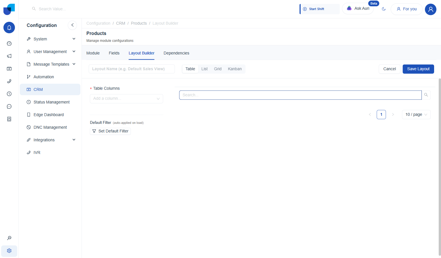
Adding a column, e.g. Category, immediately previews it against real records on the right:
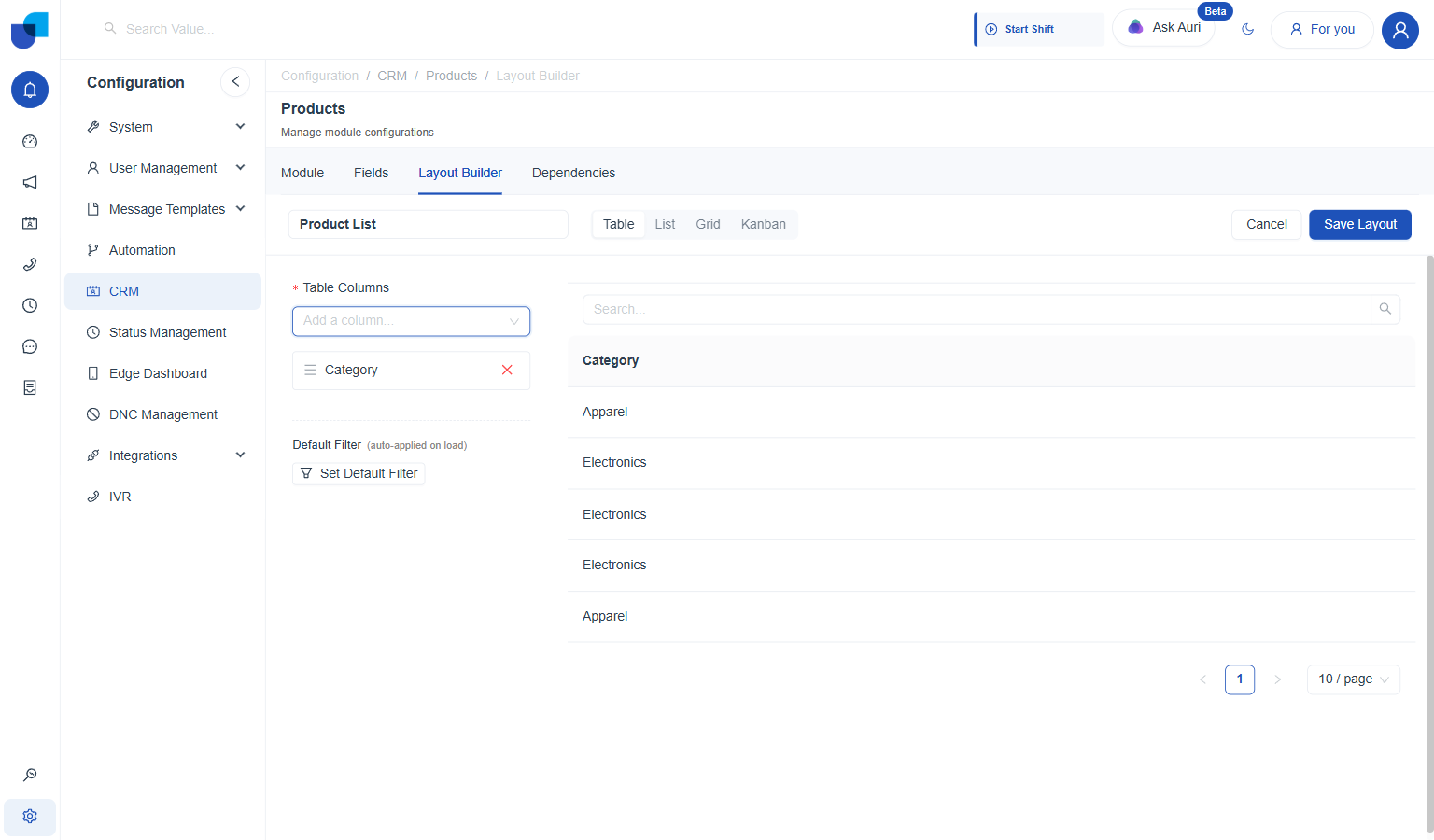
Table Columns builds the list one field at a time; the preview on the right updates immediately.
Set Default Filter opens a full filter panel covering every field on the module, including the system fields and any relationship fields like Primary Contact:
Form Layout
Controls the create/edit form: which fields appear, in what order, and grouped into which sections.
| Setting | What it does |
|---|---|
Layout Name | Labels the layout in the saved list. |
Applies To | Create and/or Edit, independent checkboxes for whether this form shows up on new records, existing ones, or both. |
Expanded / Collapsed | Whether the form's sections start open or closed. |
Available Fields | Every field not yet placed on the form, each with a drag handle. |
Add Section | Creates another named group to drag fields into, alongside the default one. |
- Open the builder. New Layout → Form Layout opens directly into an empty builder, with Applies To set to both Create and Edit, and Expanded selected, by default.
- Name it. Layout Name labels it in the saved list, e.g. "Product Form."
- Set Applies To. Untick Create or Edit to limit the form to just one of the two; leaving both ticked uses this layout for new records and existing ones alike.
- Set Expanded or Collapsed. Controls whether the form's sections start open or closed when someone lands on the form.
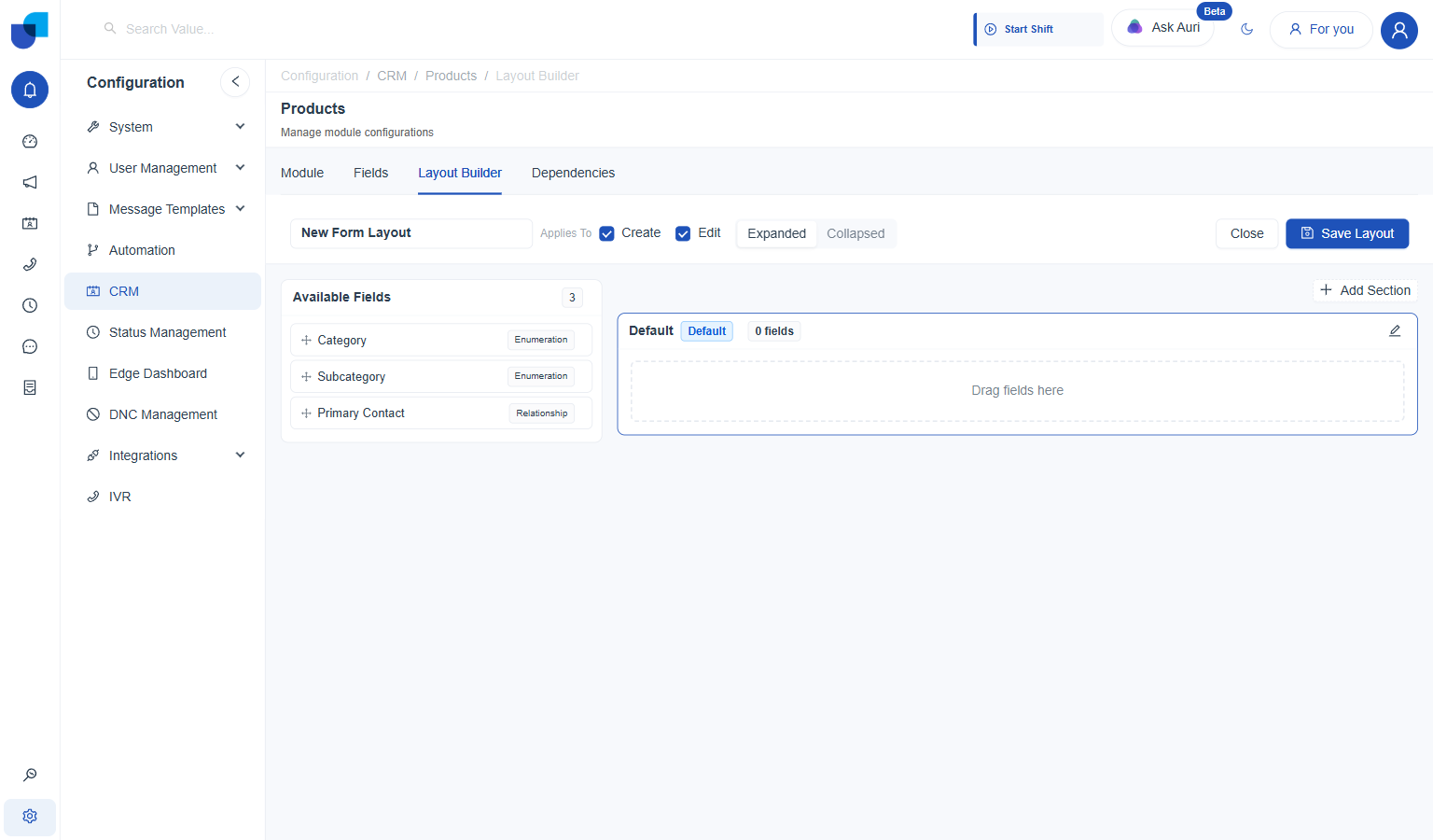
The builder starts with every field, Category, Subcategory, and Primary Contact, remaining unplaced in Available Fields, and one empty section named Default.
- Drag a field from Available Fields into the Default section. Dropping it removes it from Available Fields and places it in the section, previewed immediately with its real control, a dropdown for Category, in this case.
- Repeat for every field that belongs in that section. Each one lands in the order dropped, and can be reordered afterward by dragging within the section.
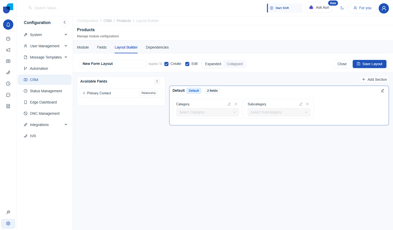
Category and Subcategory placed in Default; Primary Contact still waiting in Available Fields.
- Add another section, if the remaining fields belong elsewhere. Add Section opens an Add New Section dialog asking for a Section Name.
- Drag the remaining fields into it. Same drag motion as before, just into the new section's own drop zone.
- Click Save Layout.
On Products, a second section named Contact holds Primary Contact, separate from Category and Subcategory in Default:
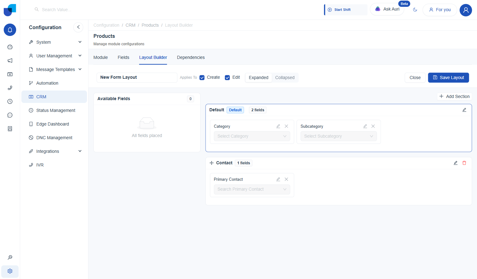
Two sections, three fields, nothing left unplaced.
Saving this Form Layout did not change the actual New Products form on Products: it still shows Category, Subcategory, and Primary Contact as one flat list, with no Default/Contact section split. The live form appears to run on its own built in field order rather than picking up a saved Form Layout automatically here.
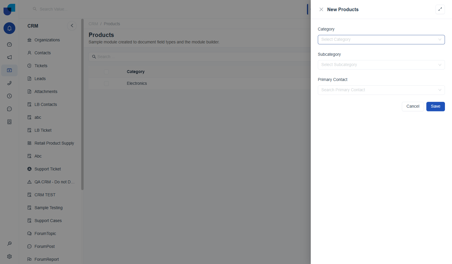
The real New Products form: same three fields, but without the section split defined in Product Form.
Summary Layout
Builds a condensed view of the record, e.g. for a preview card referencing it from somewhere else. It shares the same drag-from-a-list pattern as Form Layout, but with a single flat list instead of sections.
| Setting | What it does |
|---|---|
Layout Name | Labels the layout in the saved list. |
Available Fields | Every field not yet placed in the summary, each with a drag handle. |
Summary Fields | The fields shown in the summary view, in the order they're dragged in. |
- Open the builder. New Layout → Summary Layout opens directly into an empty builder: Available Fields on the left, an empty Summary Fields drop zone on the right.
- Name it. Layout Name labels it in the saved list, e.g. "Product Summary."
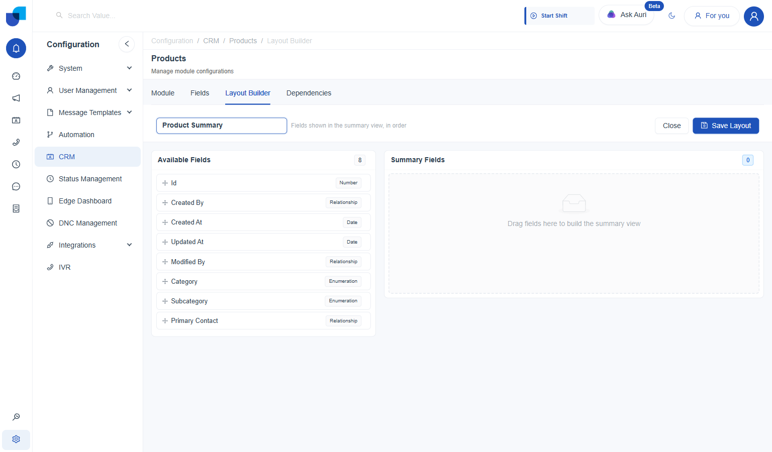
- Drag a field from Available Fields into Summary Fields. Unlike Form Layout, there are no separate sections here, just a single flat drop zone.
- Repeat for every field the summary should show. Each one gets a running number, 1, 2, 3, and so on, plus its own type badge and a remove (×) icon.
- Reorder by dragging within Summary Fields, if needed. The numbering updates immediately; this order is exactly what the summary view displays in.
- Click Save Layout.
On Products, Category, Subcategory, and Primary Contact dragged in, in that order:
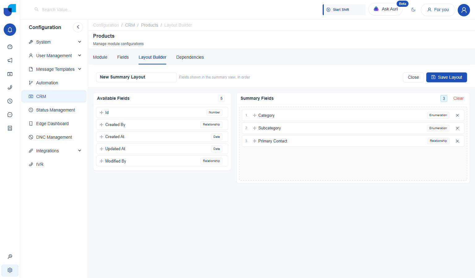
Three fields, numbered in the order they were dragged in; Clear empties the list in one click.
Managing Saved Layouts
Once saved, a layout shows up as a card on the Layout Builder tab, tagged with its type and whether it's the default for that type.
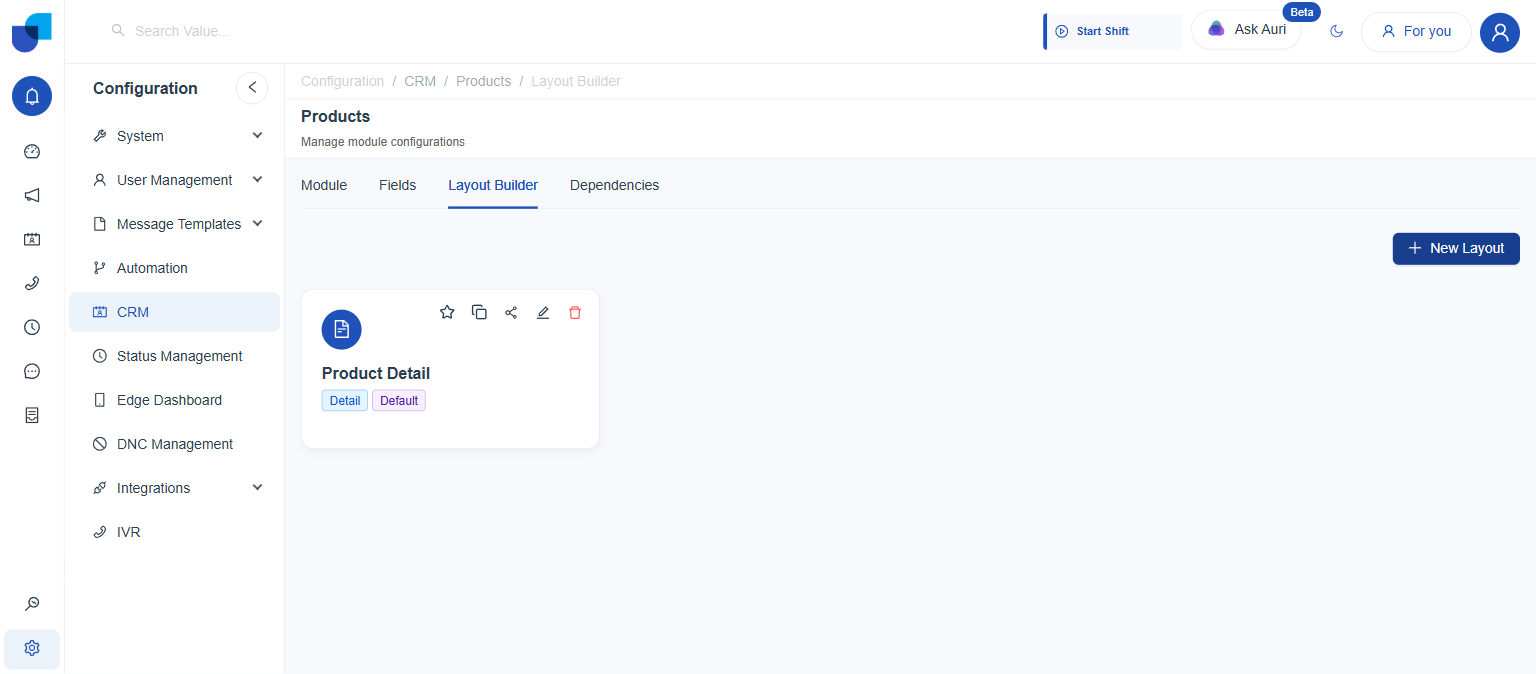
Each saved layout card carries five actions: mark as favorite, duplicate, share, edit, and delete.
| Action | What it does |
|---|---|
Favorite (star) | Flags a preferred layout among several of the same type. |
Duplicate | Creates a copy to modify without touching the original. |
Share | Shares the layout, e.g. with another module or user group. |
Edit (pencil) | Reopens the builder to change the layout. |
Delete | Removes the layout permanently. |
Sharing a Layout
Every saved layout carries its own Share Layout dialog, separate from whatever permissions apply to the module or its records. This controls who else can even see and use that particular layout.
- Click the Share icon. The share icon is located on the layout's card, alongside favorite, duplicate, edit, and delete.
- Review People with access. The owner is listed here by default, e.g. the person who created the layout, tagged Owner.
- Add specific people, groups, or roles, optionally. The type dropdown switches between User, Group, and Role; the search box next to it finds and adds a specific one to the People with access list.
- Set General access. Restricted or Users with module access, covered in detail below.
- Click Done.
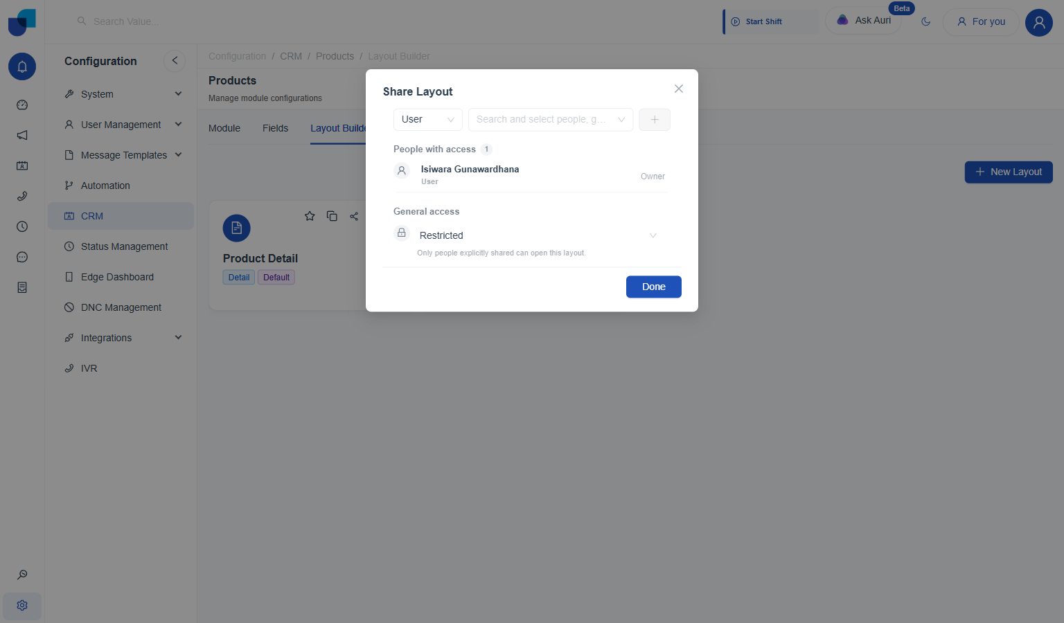
By default, General access is Restricted: "Only people explicitly shared can open this layout."
Switching General access to Users with module access opens up a second dropdown for the permission level itself:
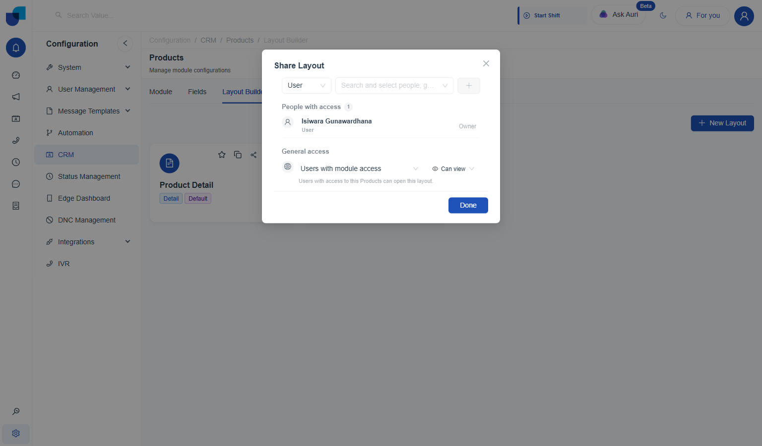
"Users with access to this Products can open this layout," once General access moves off Restricted.
| General access | Meaning |
|---|---|
Restricted | Only people explicitly added to People with access can open this layout. |
Users with module access | Anyone who already has access to the Products module can open this layout, without being added individually. |
| Permission level | Meaning |
|---|---|
Can view | Can open and use the layout; can't make changes to it. |
Can edit | Can make any changes to the layout itself. |